Design
Keeping The Print Dream Alive
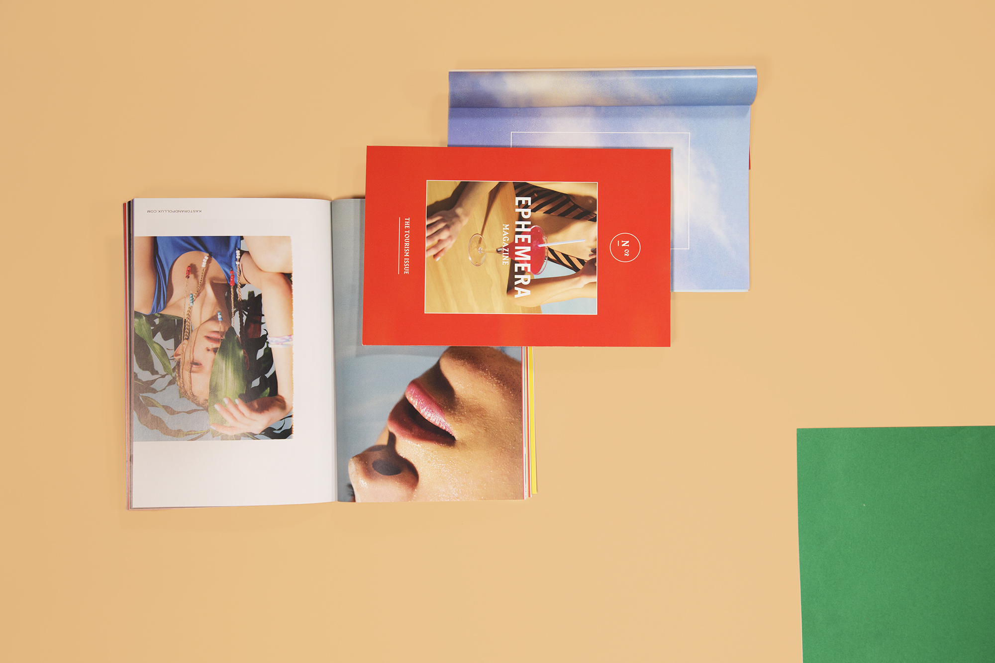
When I was younger, one of my (many) dreams was to work in print media – more specifically at a fashion magazine, and even more specifically, at Nylon Magazine. I think it was mostly accredited to the “newness” of Nylon’s content; in comparison to the glossies I had sustained on my monthly Walmart roster, Nylon was ~new~ and ~edgy~ and ~progressive~ – and therefore endlessly fascinating.
Contrary to your initial inclinations (probably), my penchant for print wasn’t deeply rooted in dreams of being a fashion editor. Even though I definitely appreciated the glamourized image of interning at Teen Vogue a la Lauren Conrad, I was much more interested in pursuing a craft that allowed me to create layouts, organize content, and push pixels around lol. While I’ve always considered myself to be a pretty hands-on person, designing an overall experience behind a screen seemed way more rewarding than being on sets and selecting wardrobe. Much the same, design generally seemed more timeless and sustainable than a world dictated by fast fashion and disposable trends.
Objectively successful “design” will extend farther than trends and niches. While beautifully designed content is great and rewarding to look at, editorial design prioritizes function over form.
My stint in graphic design school enabled me to continue pursuing print. While my peers were focused on web and UX, I took any opportunity to create books that combined my love for writing with my “interest” in design. Despite the fact I was fully ~*blogging*~ at the time, I was still obsessed with the idea of creating something tactile, because I loved the idea of being able to hold something that I created on a screen.
By the time I finished school, despite a lengthy list of print projects under my belt, all the jobs were in digital, and print was forcibly out of the picture. So, along with the death of my long-lived career dreams, came the rise of my New Digital Life and the influx of mail in my literal, non-digital mailbox. Hand-in-hand with the growth of my blog/my agency jobs/the like, came press packages, product samples, and poorly presented media alerts stapled together and stuck in a duotang. For years I was conditioned into thinking me on handful of press lists was just “whatever”; but then I realized my everyday reality was a string of missed opportunities.
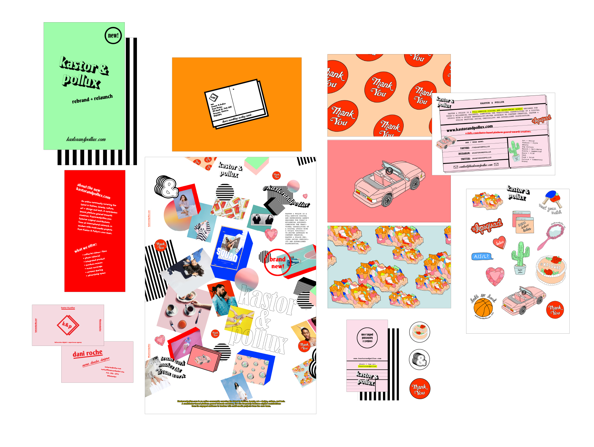
Bringing it back down to the basics, I flipped the switch and made my own press list. Who doesn’t like something a little unexpected??? What better way to get someone’s attention than to send them unexpected mail??? “This is a power play, for sure”, I whispered as I scoured LinkedIn to find the right recipients of my mailer. “No one would ever expect a “blogger” living on “the Internet” to send LITERAL MAIL.
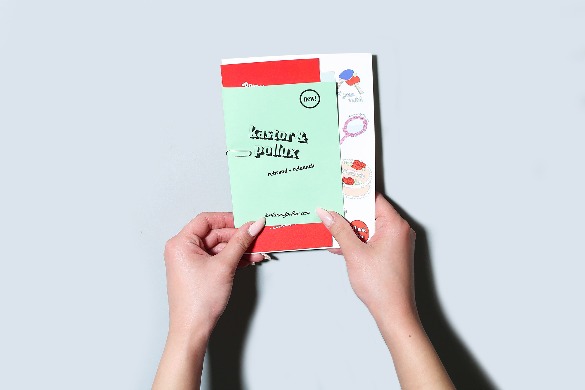
There are so many people that I want to connect with/continue to work with – from strangers at my favourite publications, to PR connections that I’ve worked with over the years, to friends (old and new). At the core of it, my intention with this print package was to create a memorable experience for the receiver. I feel fortunate to have resources at my disposal – from media contacts to really big printers that do really cool things – and I feel lucky to be able to optimize them to revisit what I used to know best.
I often ask myself a lot what it /truly/ means to be a blogger. I think we’re all so caught up with titles and “roles” that we forget that there are really no rules when it comes the Internet’s state of perpetual grey areas. If bloggers are “content creators”, “creative directors”, “photographers” and their own publicists, managers, and accountants, then why shouldn’t they be the senders of mail as well as the receivers?
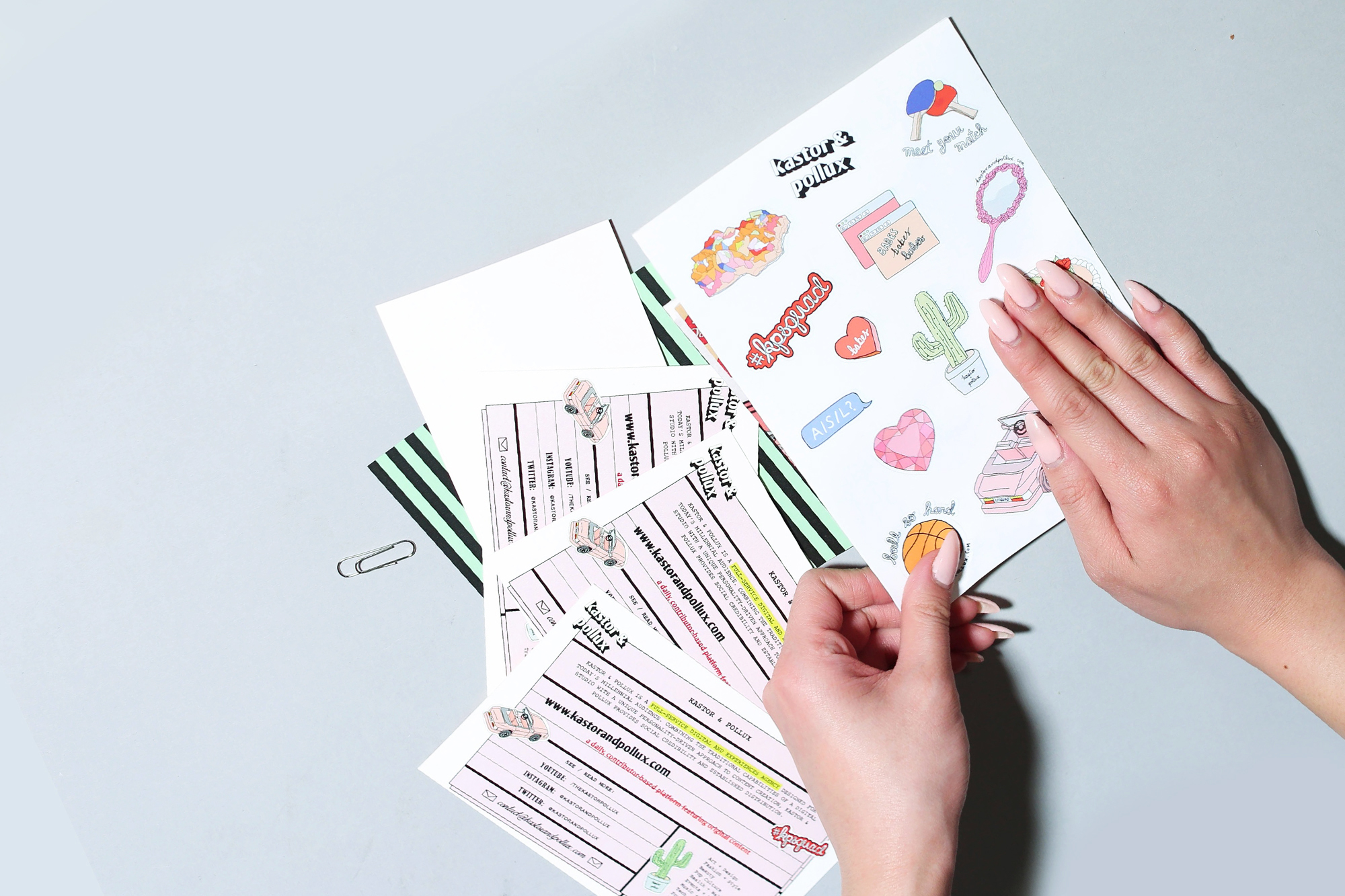
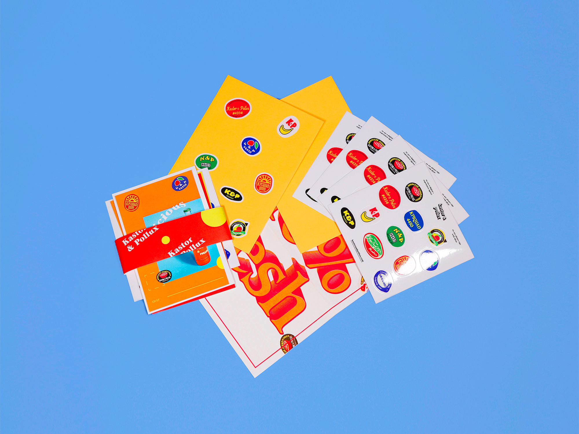
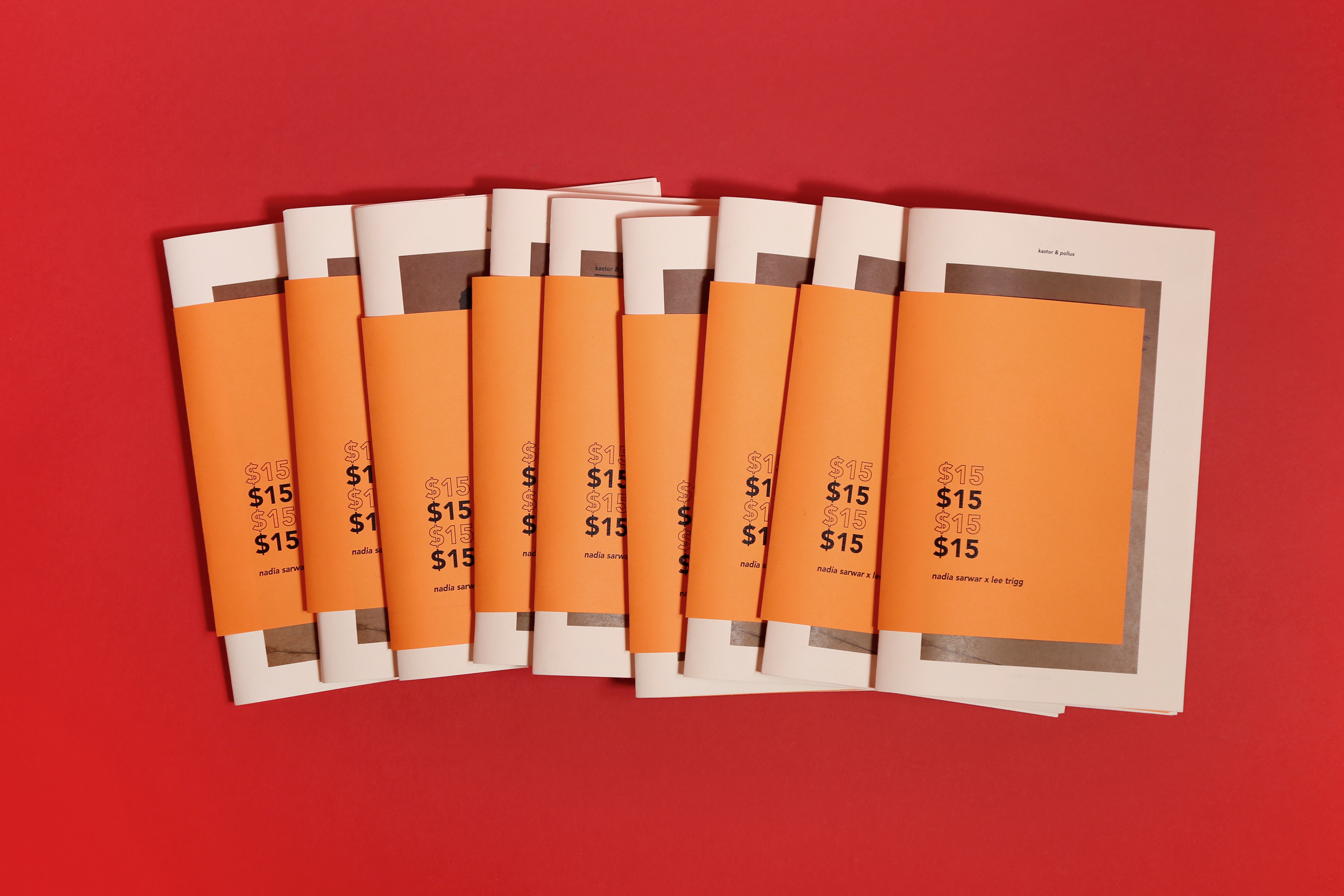
I based the contents of the package around things that I knew /I/ would be stoked to receive. Obviously, since form follows function, the purpose of the mailer was to convey that Kastor & Pollux had relaunched and rebranded as a digital and experiences agency, and kastorandpollux.com was now a contributor-based editorial platform boasting daily content across 10+ verticals. However, I wasn’t interested in creating something that would be tossed out immediately after receipt. I wanted to give my material a fighting chance to be something that its recipients might actually hold on to!
During my early days of editorial infatuation/Nylon Magazine daydreaming, I cherished each print issue with vigour, compassion, and more. It would be stupid and embarrassing to assume the same thing of this project, but I really do believe that presentation is everything – and after a 14 hour print day with Simone, I feel like that merits something, probably.
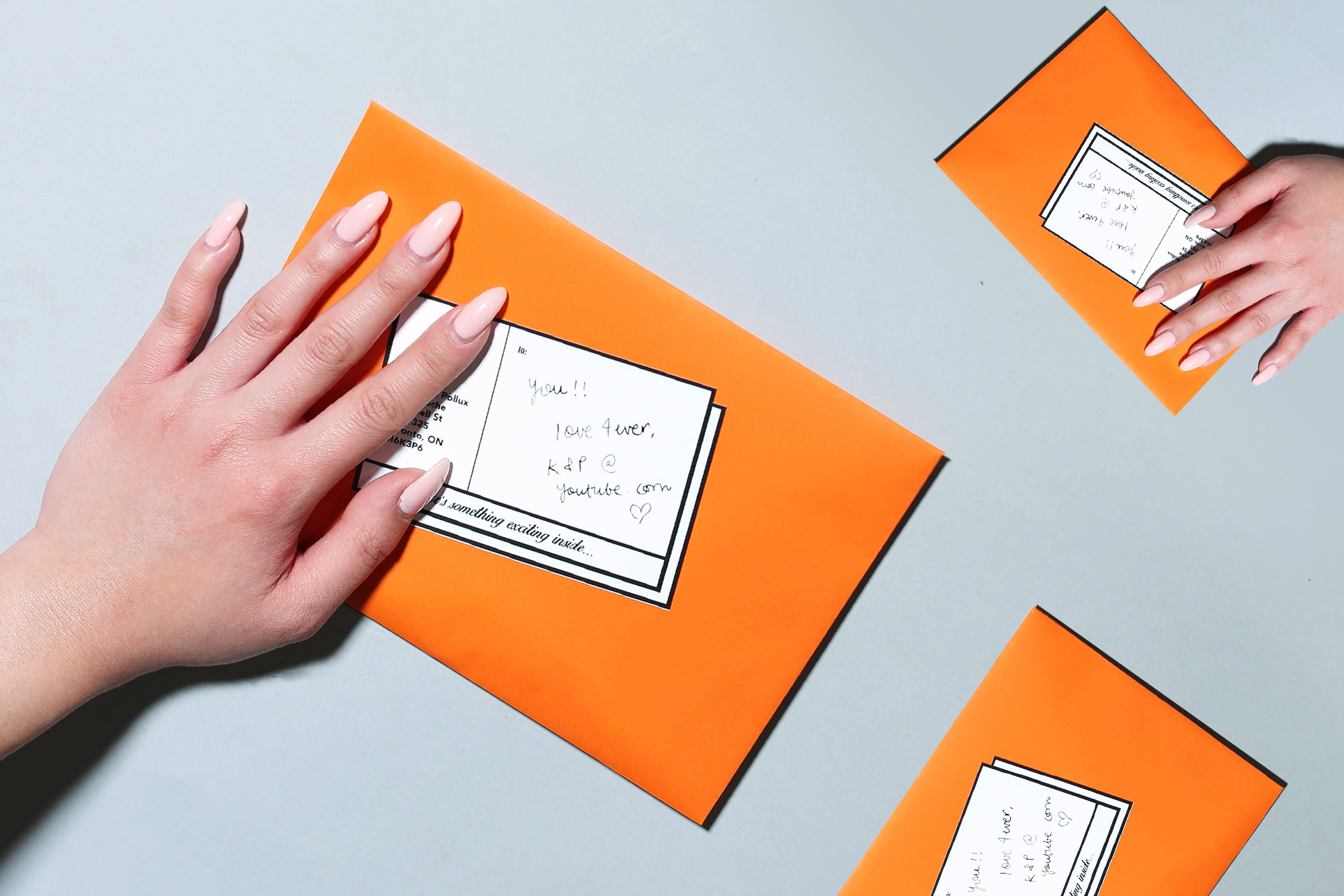
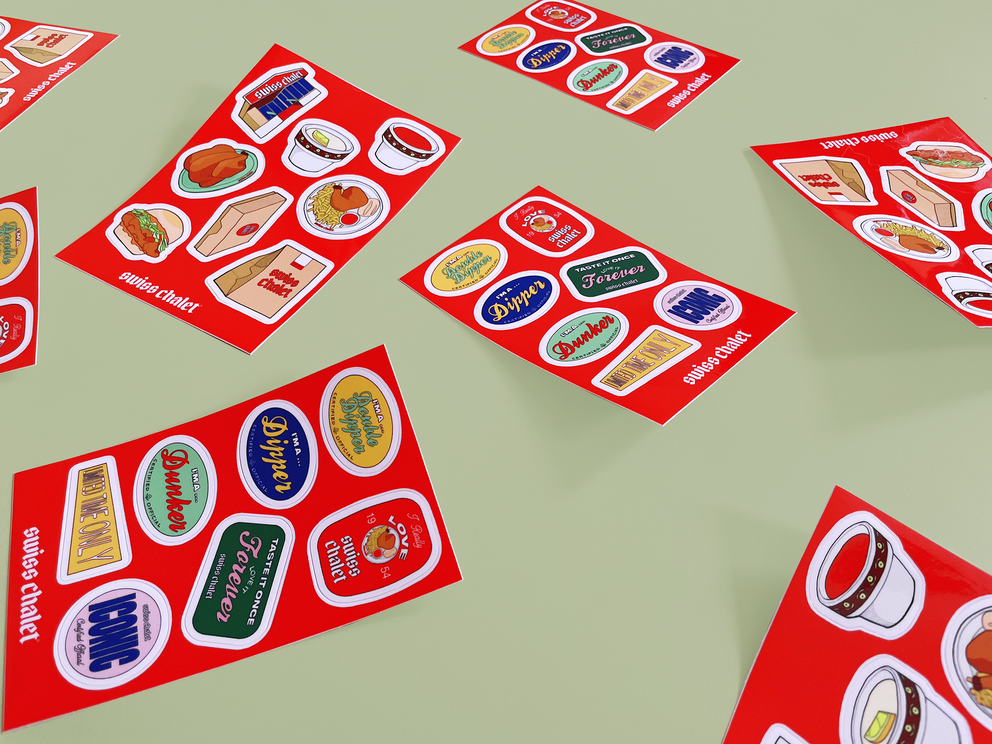
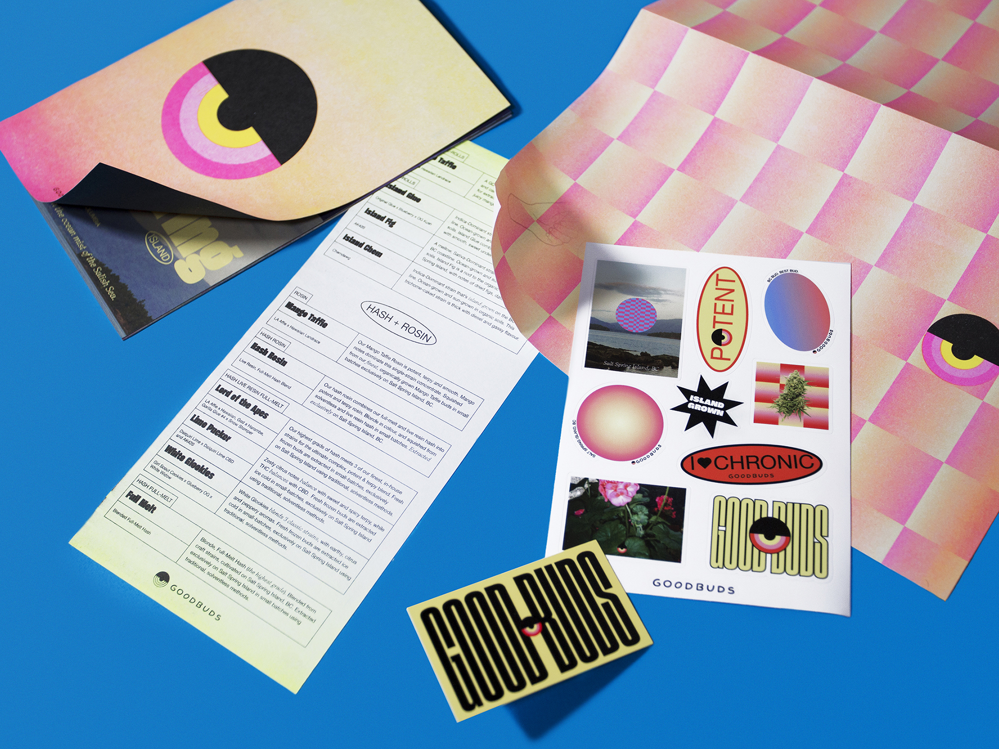
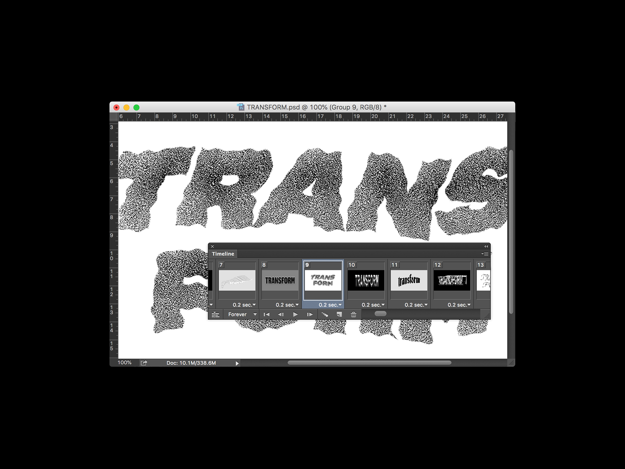
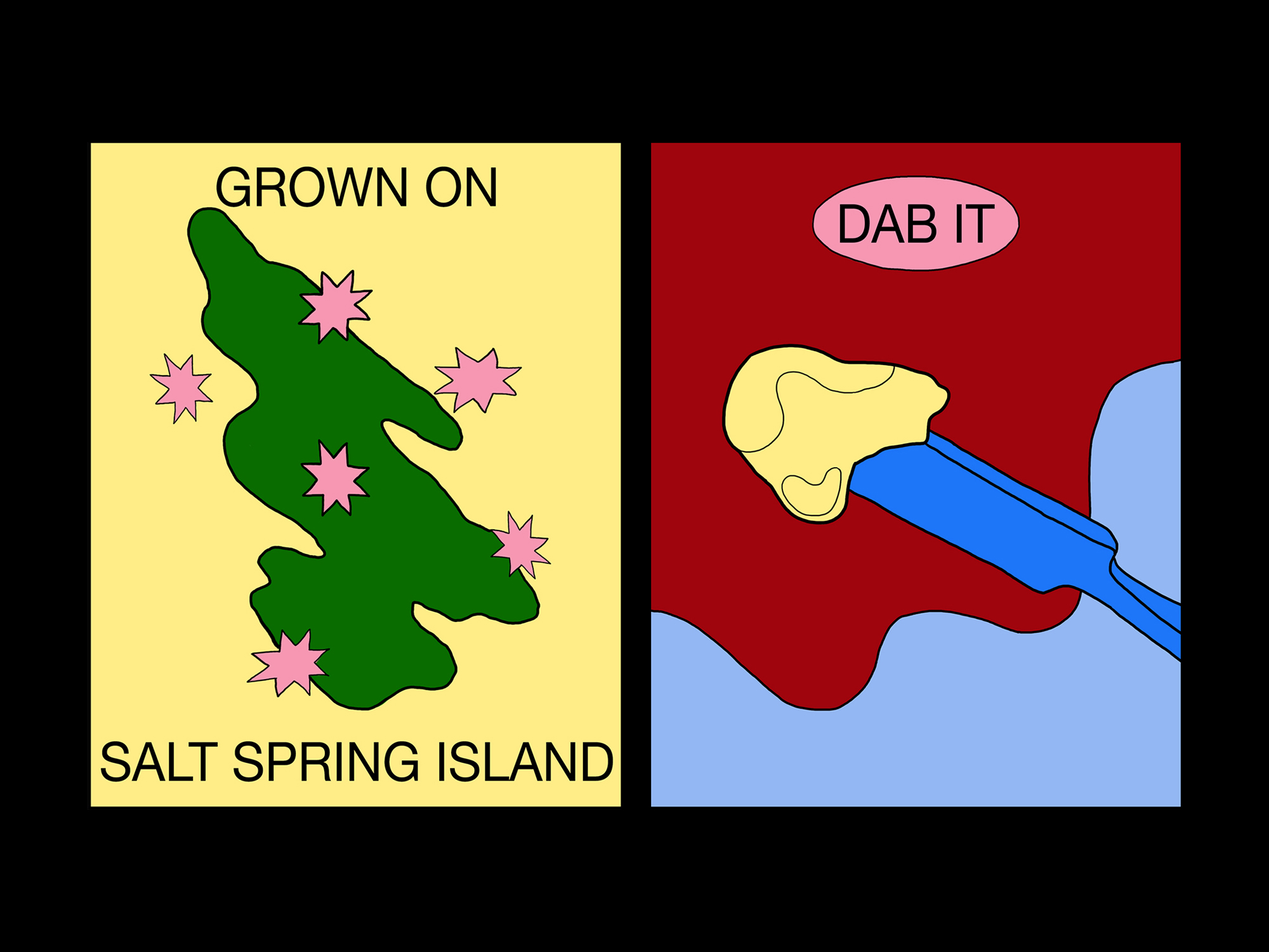
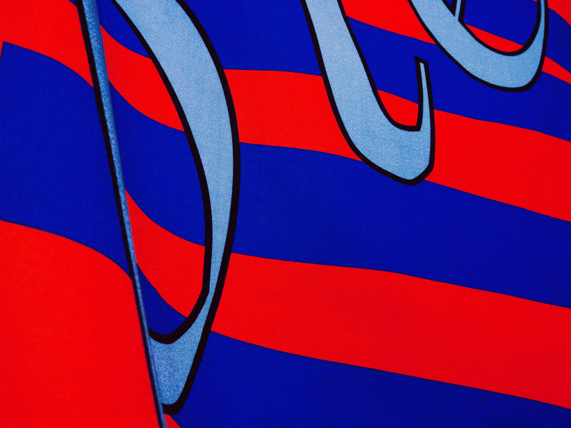
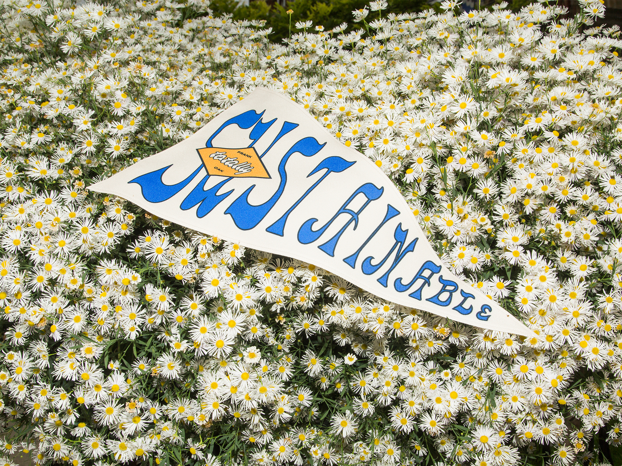
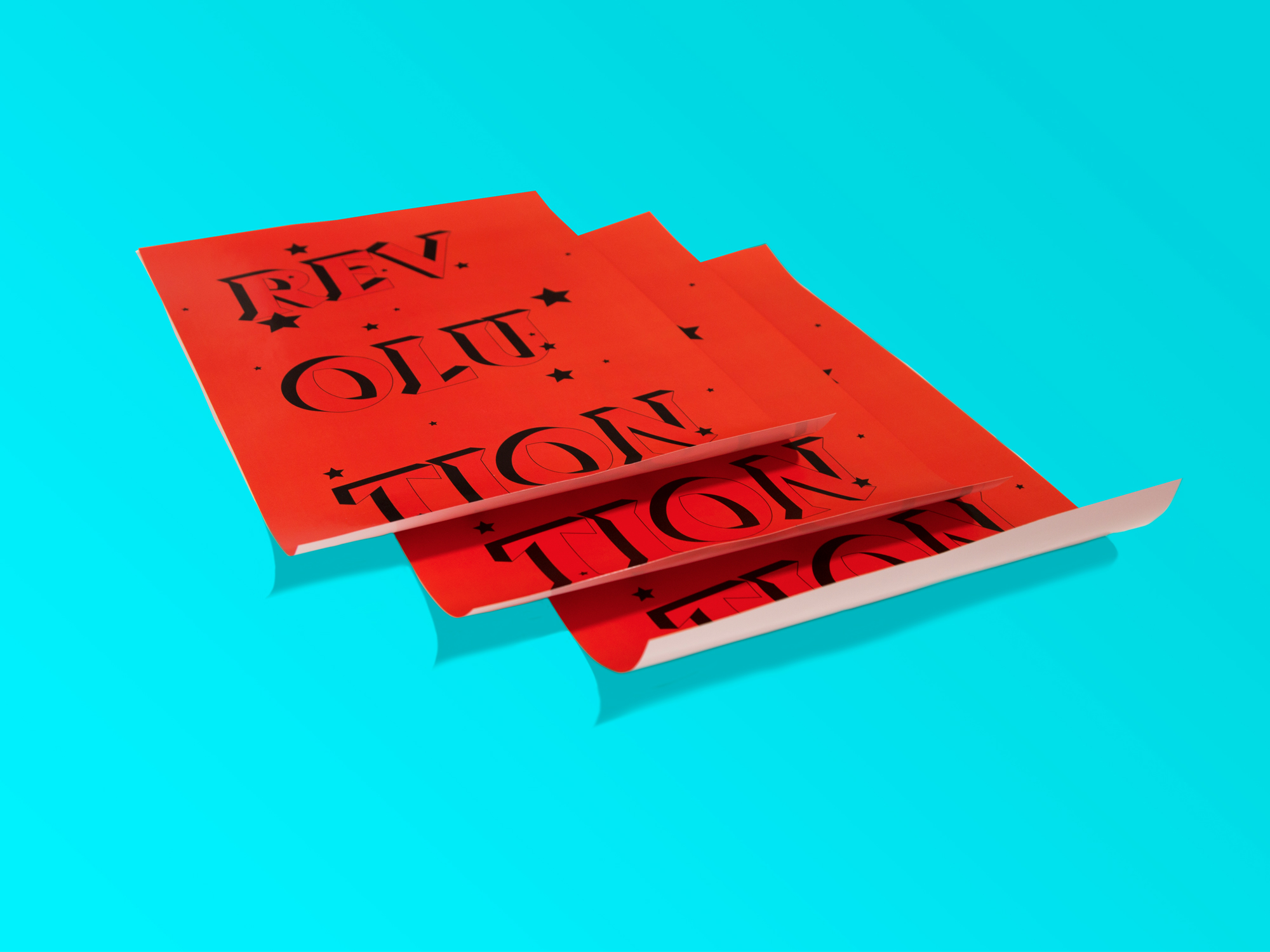
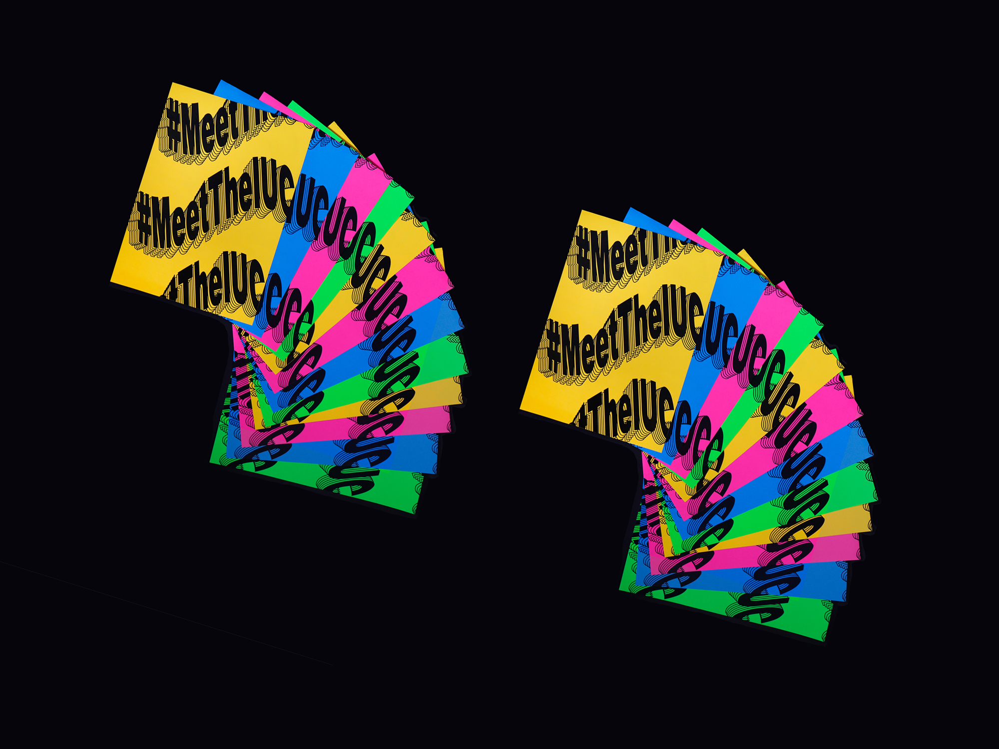
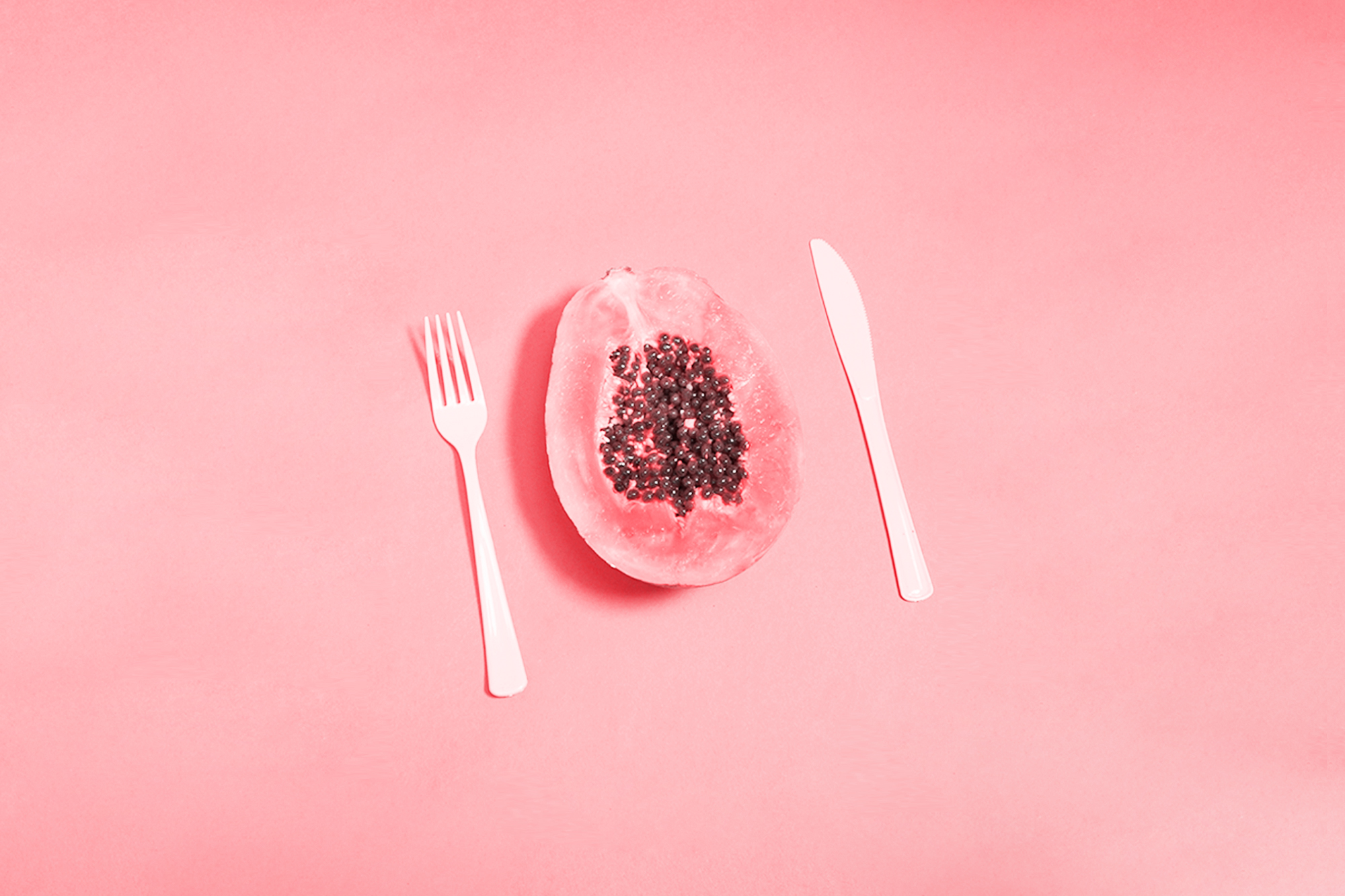
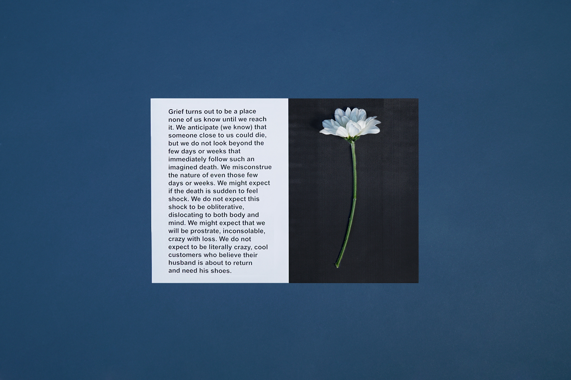
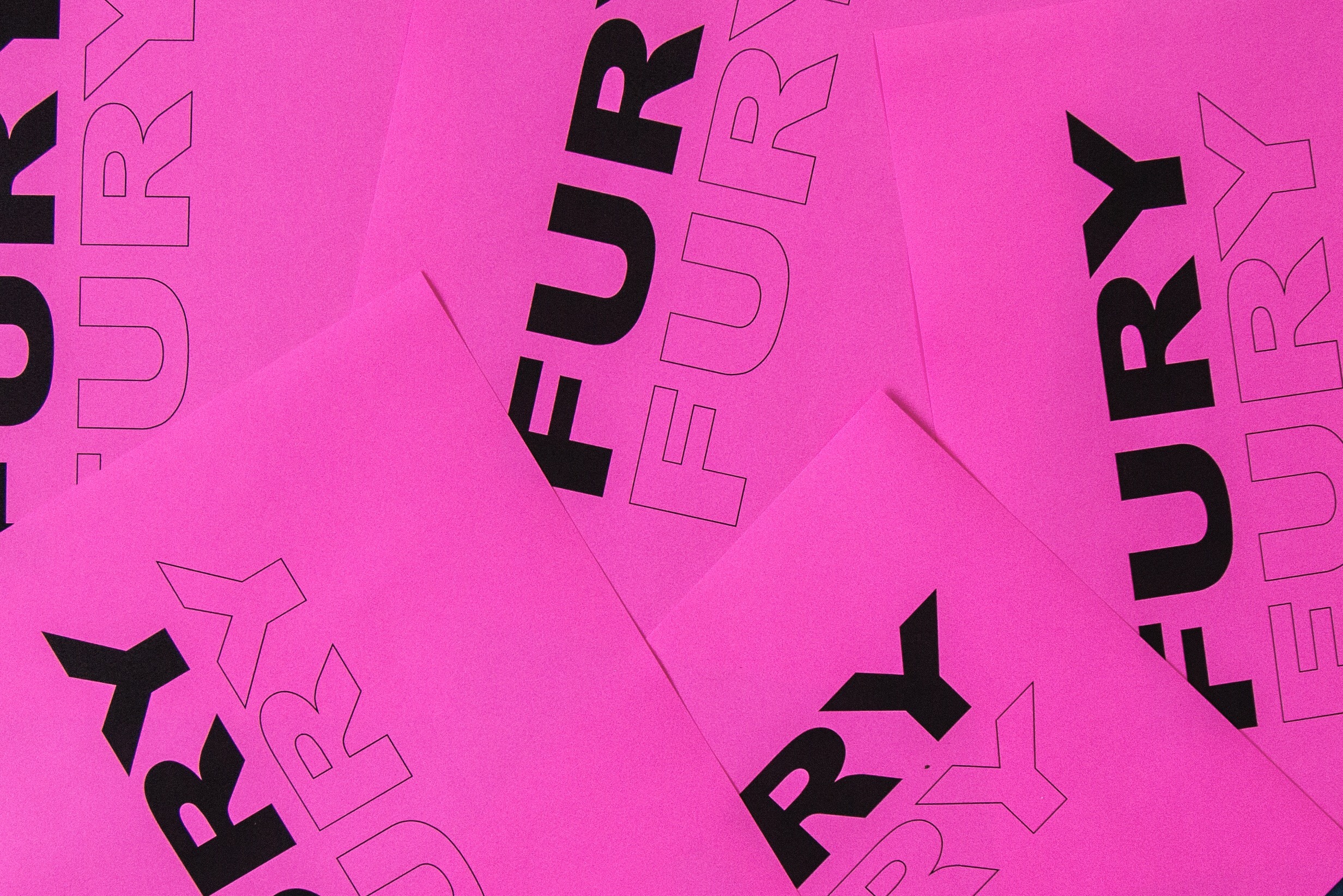
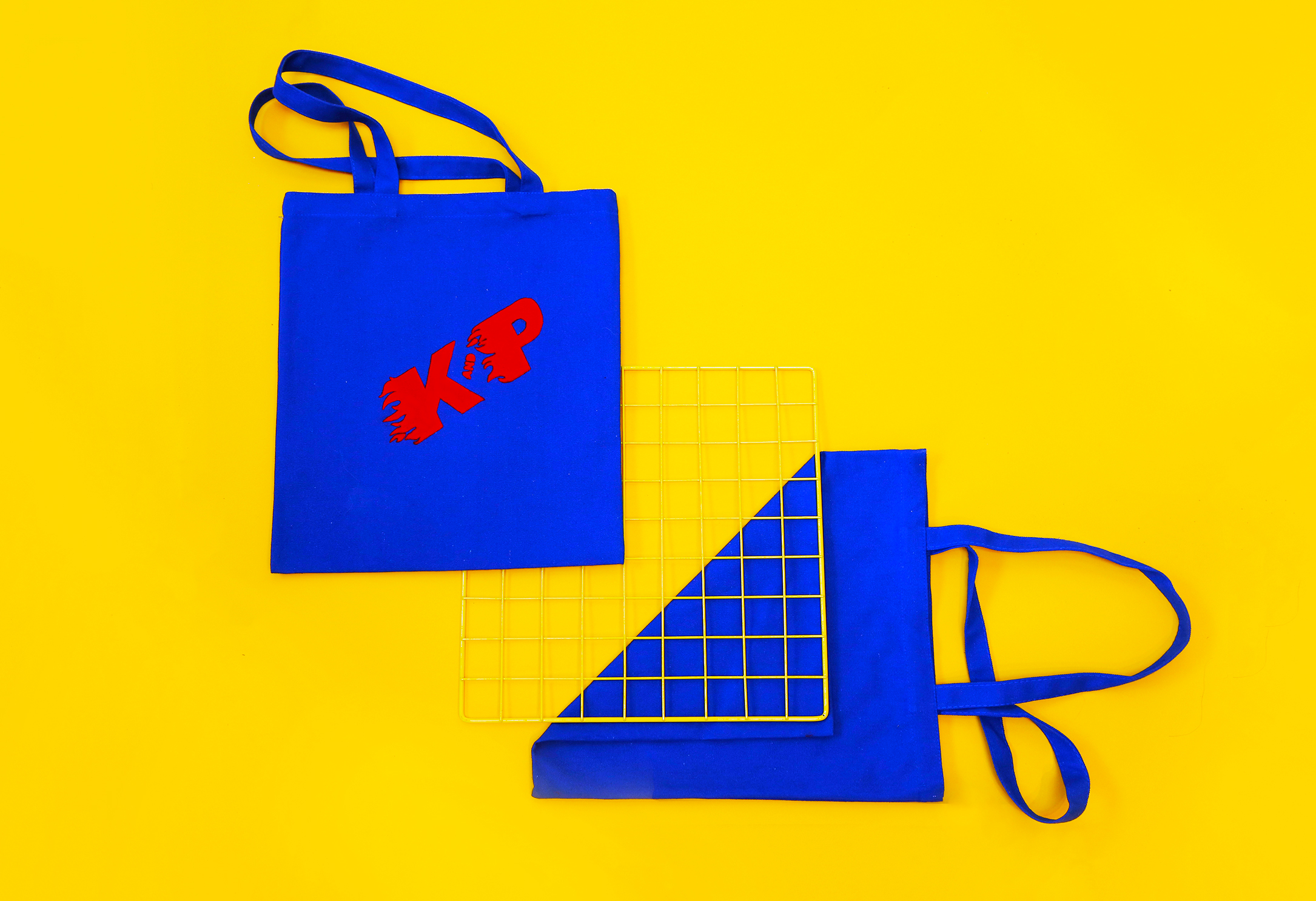
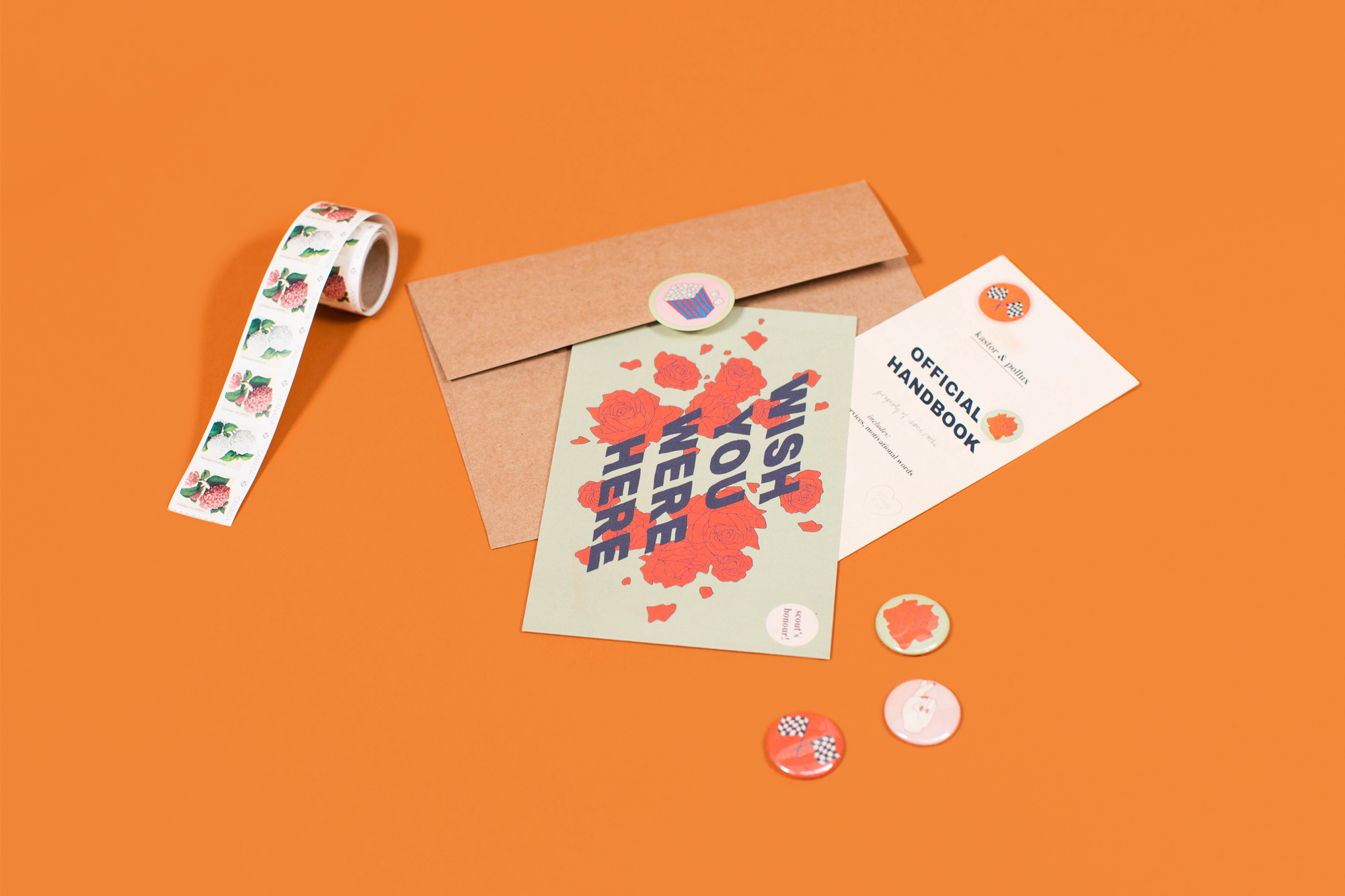
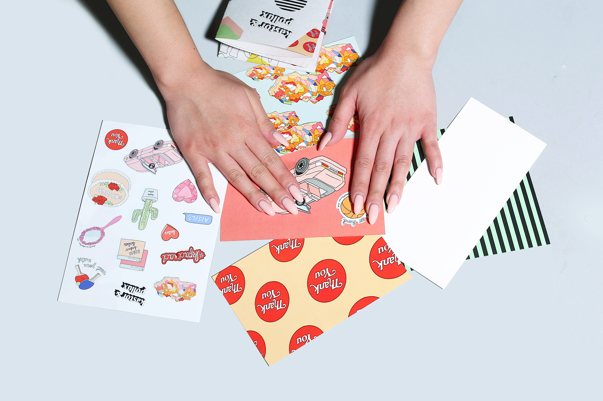
Krizia helped me create this stop-motion video to document the package. Containing a fold-out poster, 3 “postcard” prints, a sticker sheet, and a button, the mailer was packaged up in an orange envelope alongside a hand-written note (lol). If you received one, I hope it made you smile. If you didn’t…well, just watch the video.
