Design
#SeeYourselfDifferently with Topshop Canada
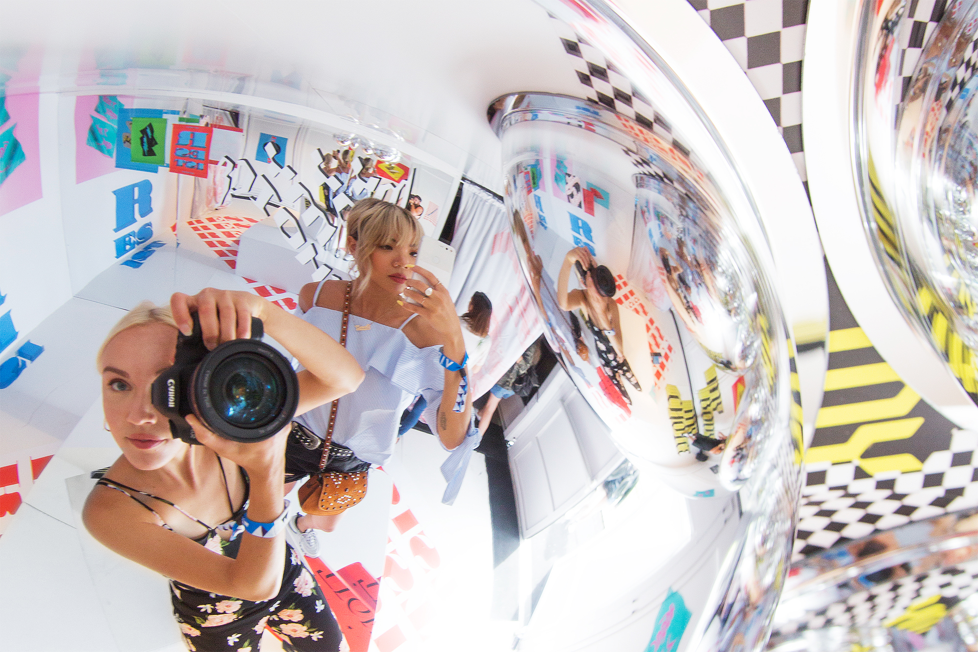
During my university days I put myself through school by working as a sales associate and later visual merchandiser at Topshop. As one of the first employees at the new Queen St. West location in Toronto, the friendships I made lessons I learned there will always remain near and dear to my heart. For this reason I was exceptionally stoked when the Canadian team reached out to Dani Roche and I with an opportunity to collaborate. We were tasked with designing 2 out of the 4 rooms for their upcoming installation at Wayhome music festival. Drawing inspiration from the brand’s summer trends “Wearing How You Feel” and “Modern Romance” we created two totally different yet uniquely K&P projects.Fabrication and production was executed by our friends at Diamond Agency. Major shout out to their team for lending their expertise in all things vinyl and structural. The only thing that could have made the weekend better was if Frank Ocean rolled though the installations before his set. … a girl can dream….
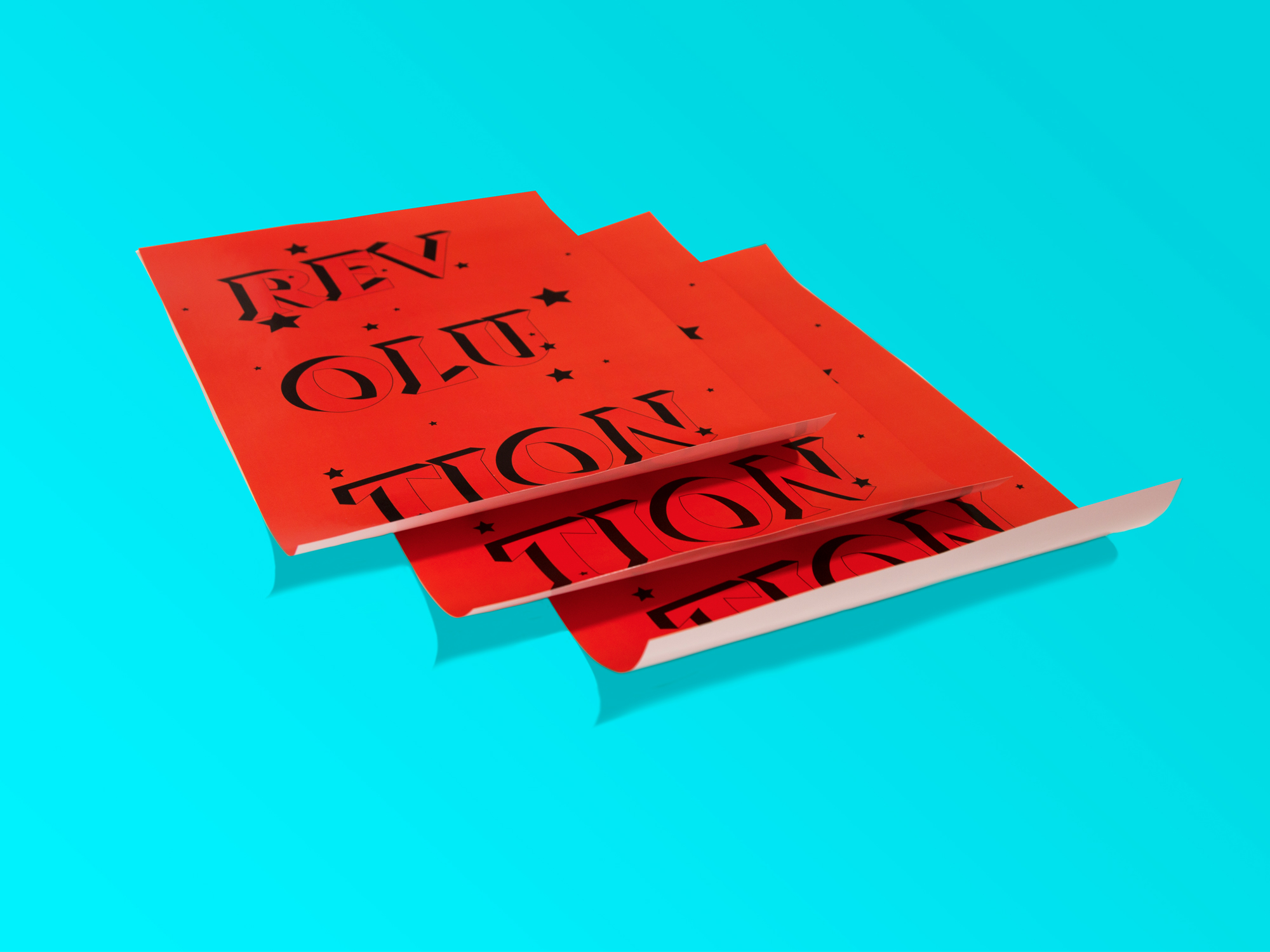
WEARING HOW YOU FEEL
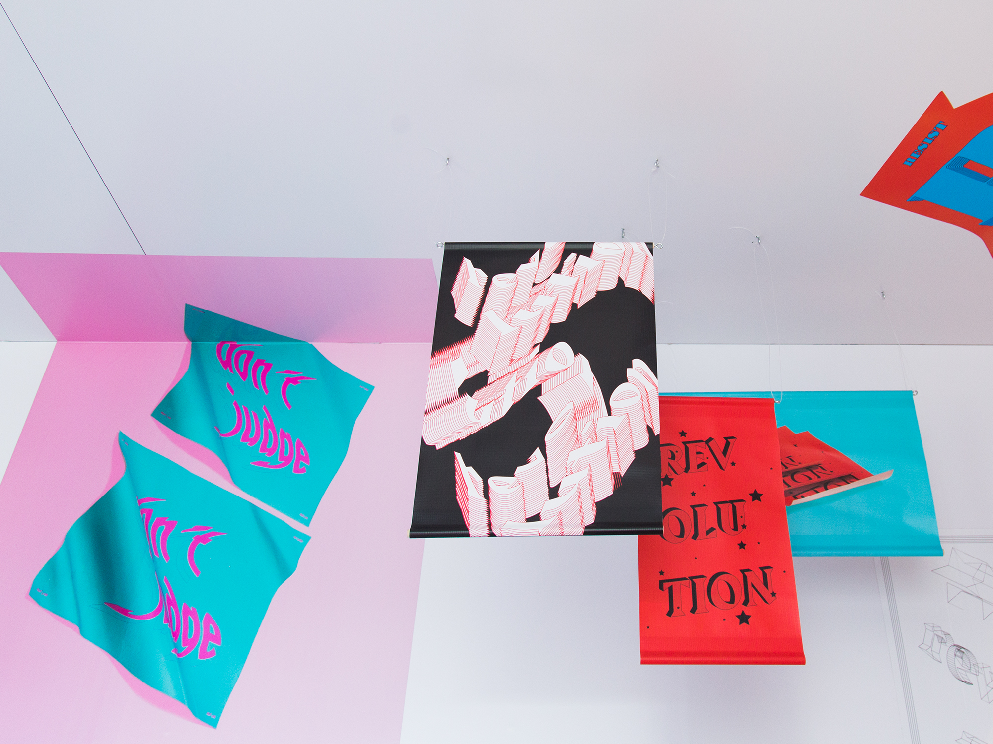
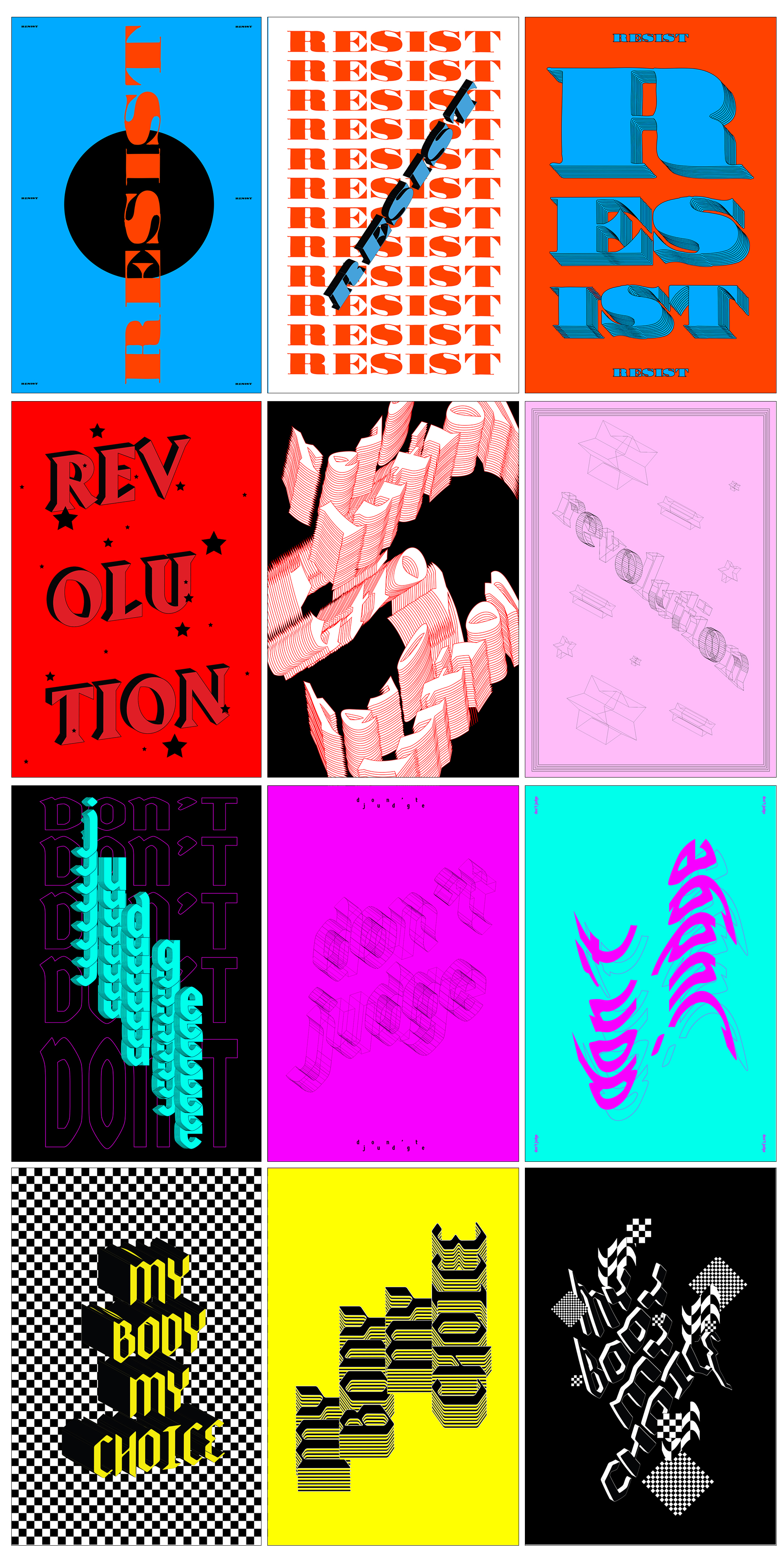
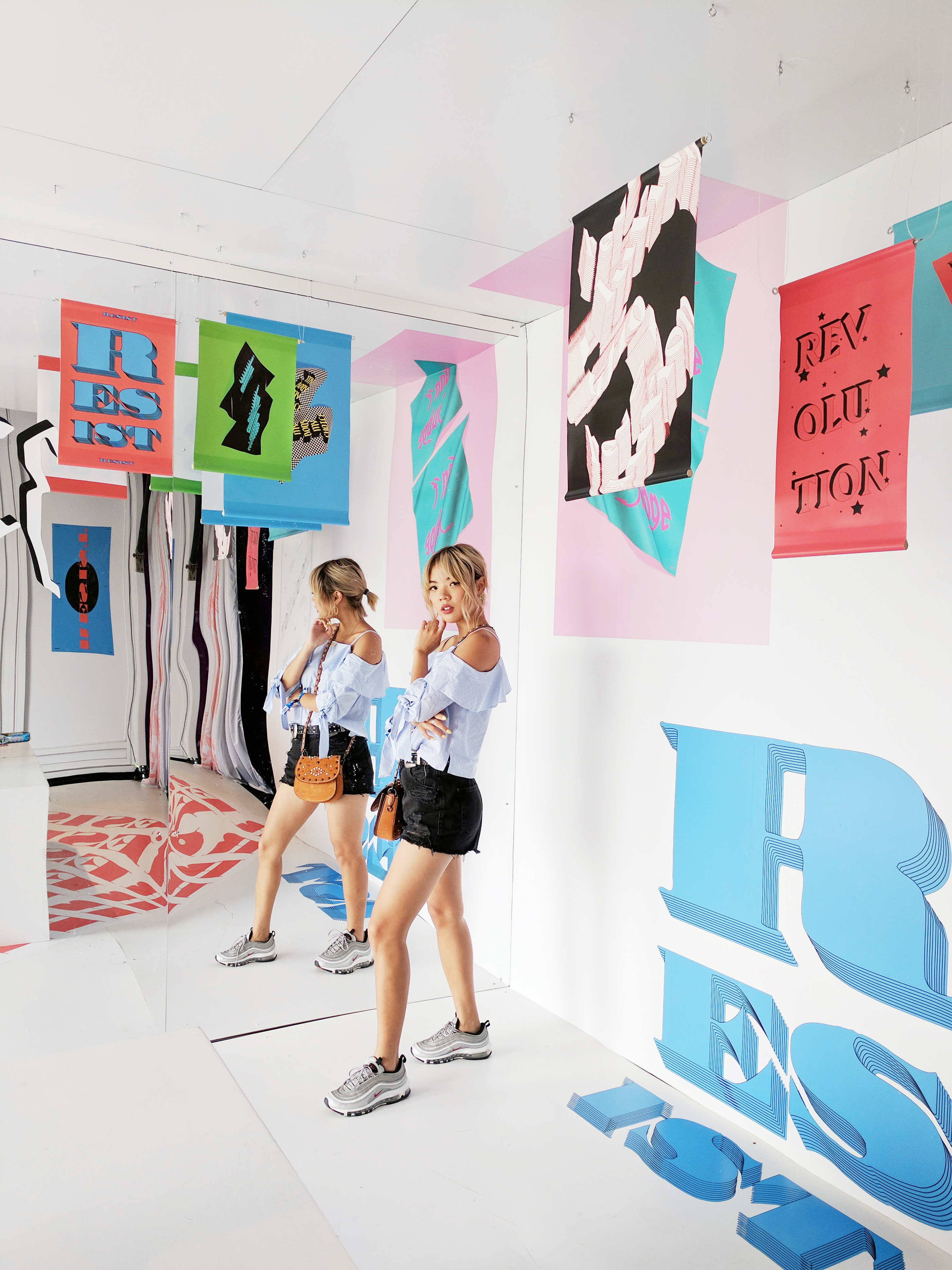
In his 1964 book “Understanding Media: The Extensions of Man”, Marshall McLuhan coined the phrase “the medium is the message”. Thus, this room – inspired by the act of protest – focuses on language as a medium.
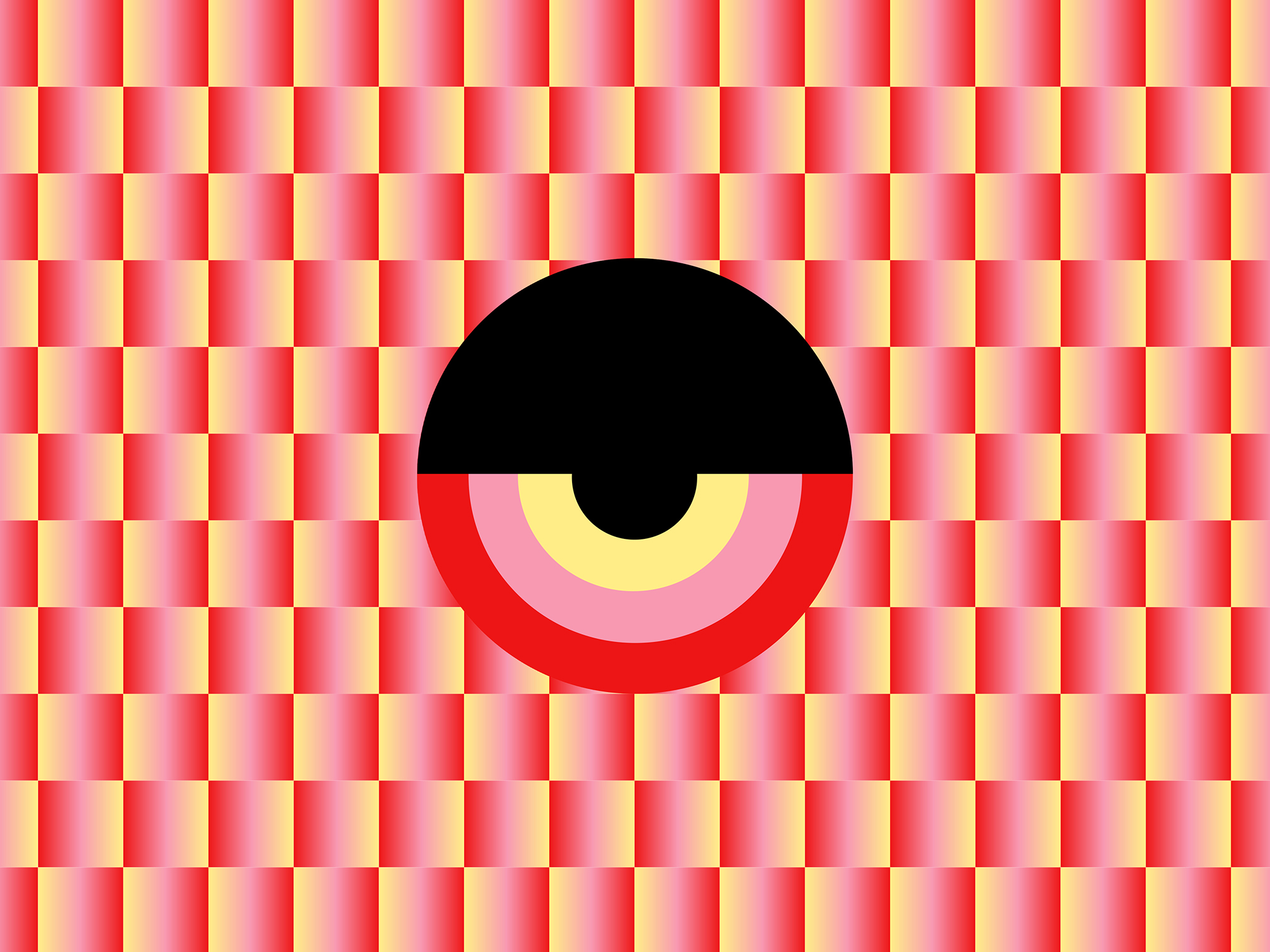
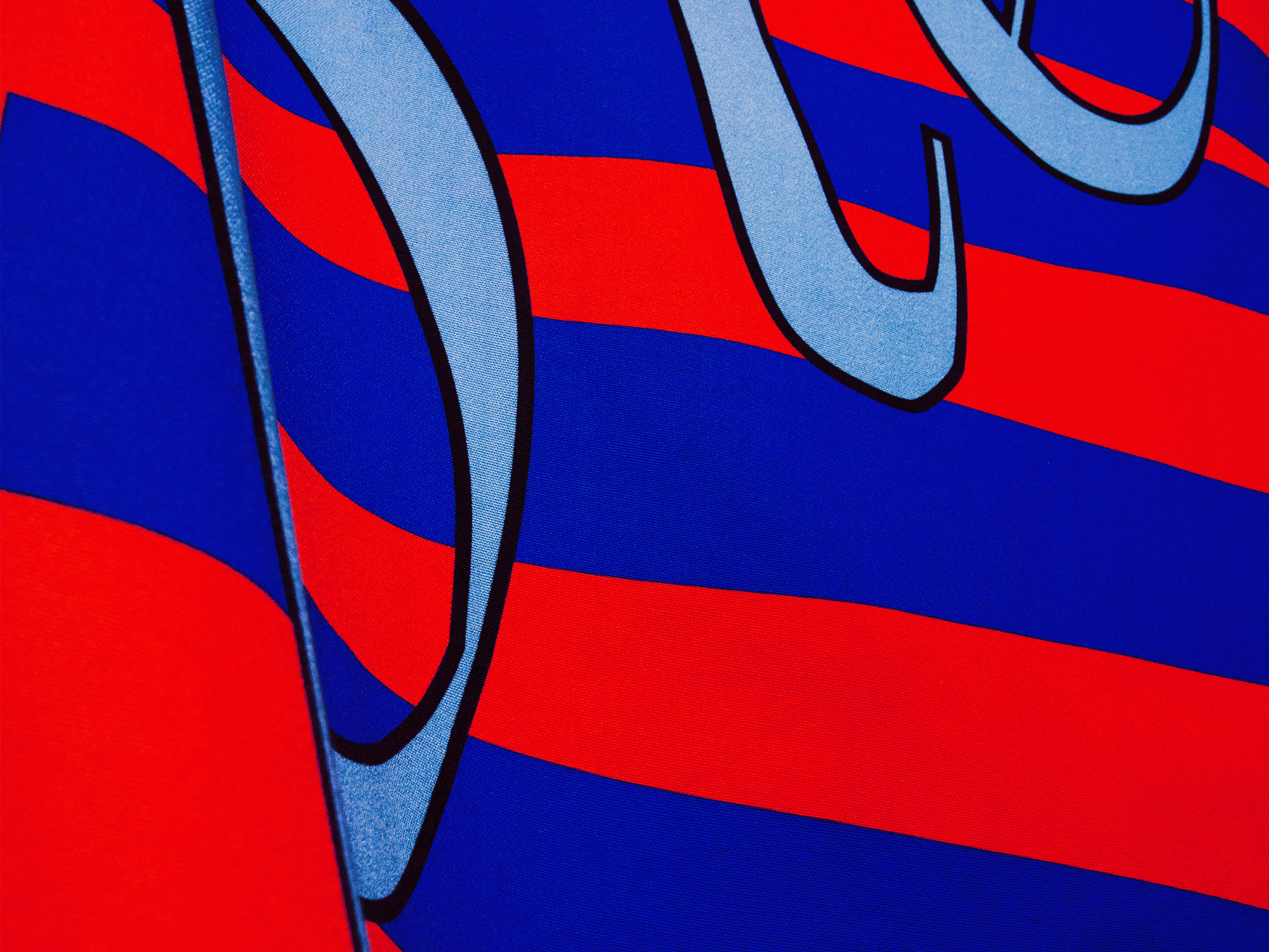
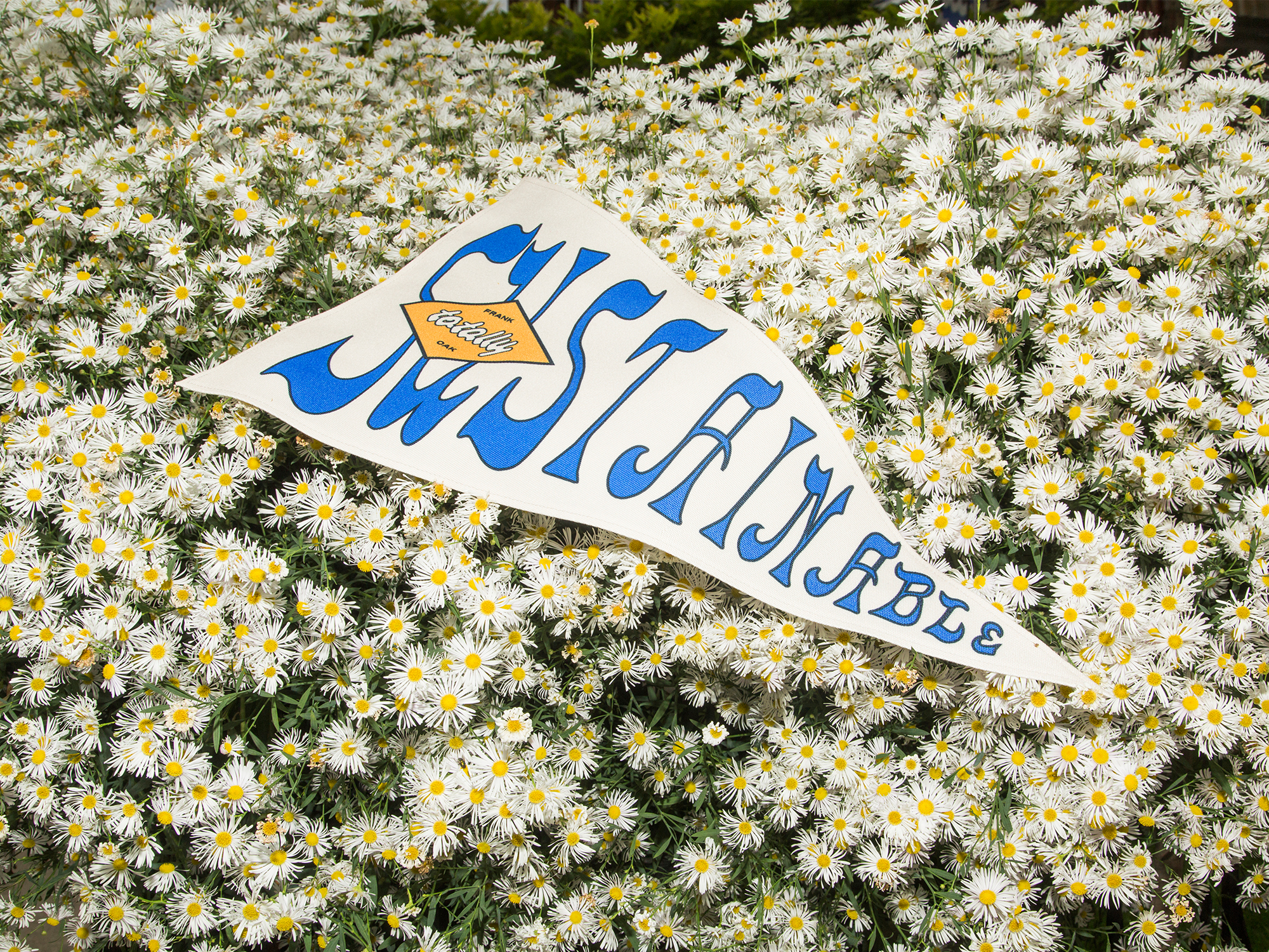
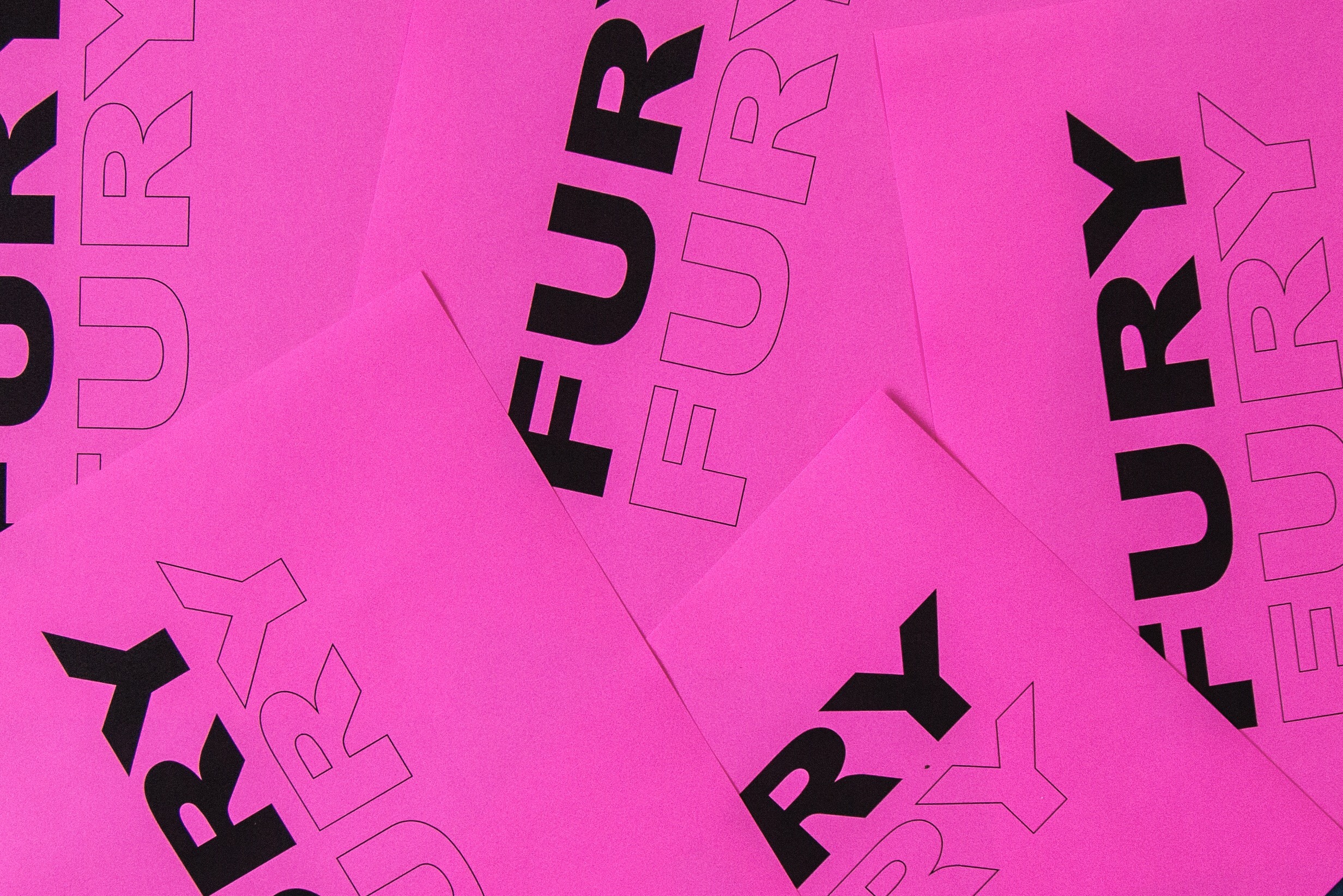
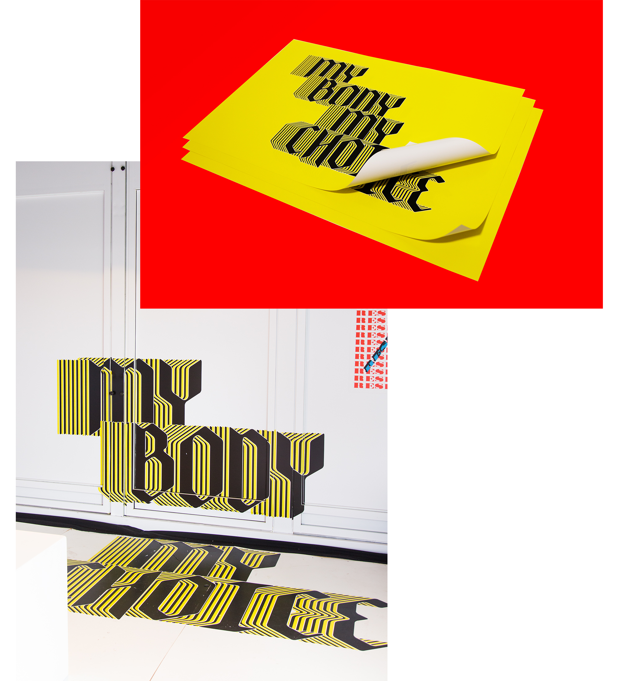
Using a stark white room as our canvas, we created a series of text designs that invade and envelope the space – melding surveillance with gallery. In our current sociopolitical climate, it is important to create a discourse about participation, and question what it really means to be an active participant in our communities. Through typography, we demonstrate that our identities are shaped and controlled by our surroundings.
MODERN ROMANCE
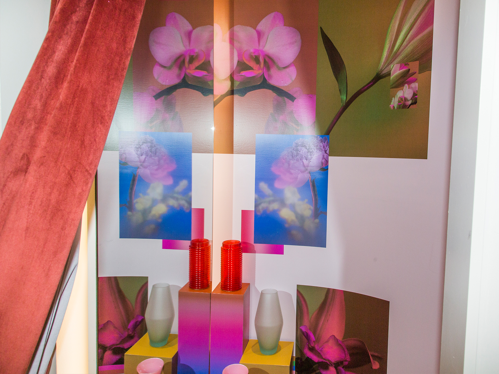
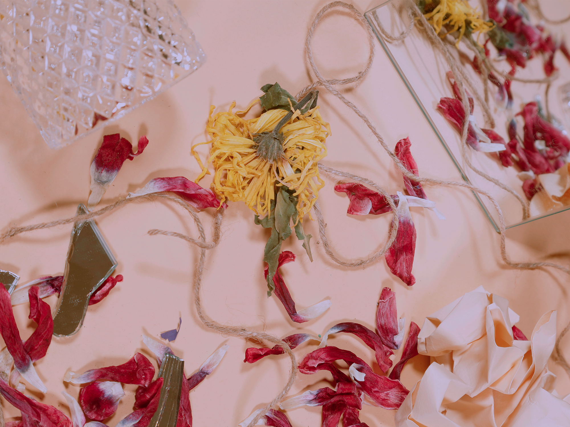
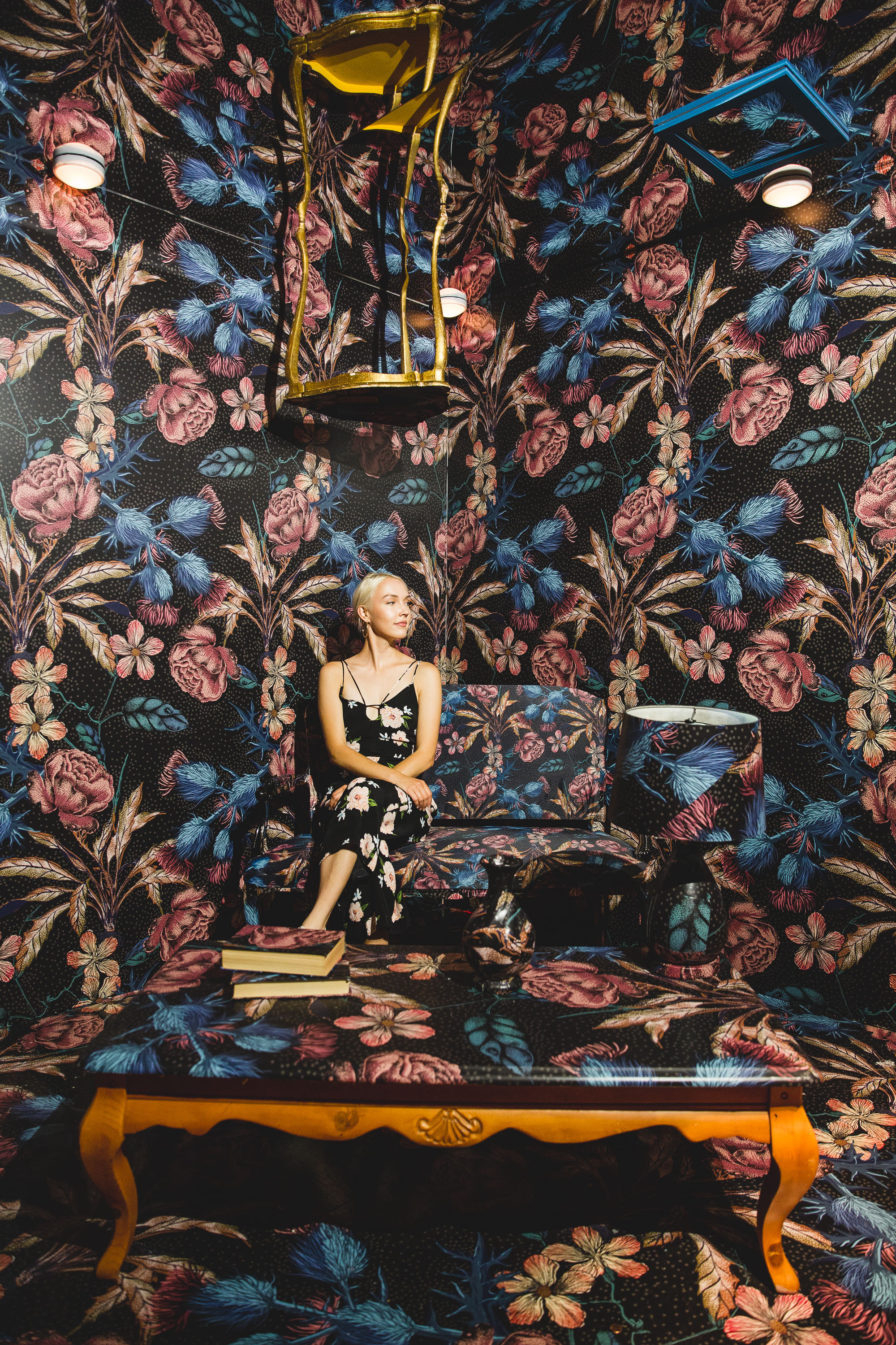
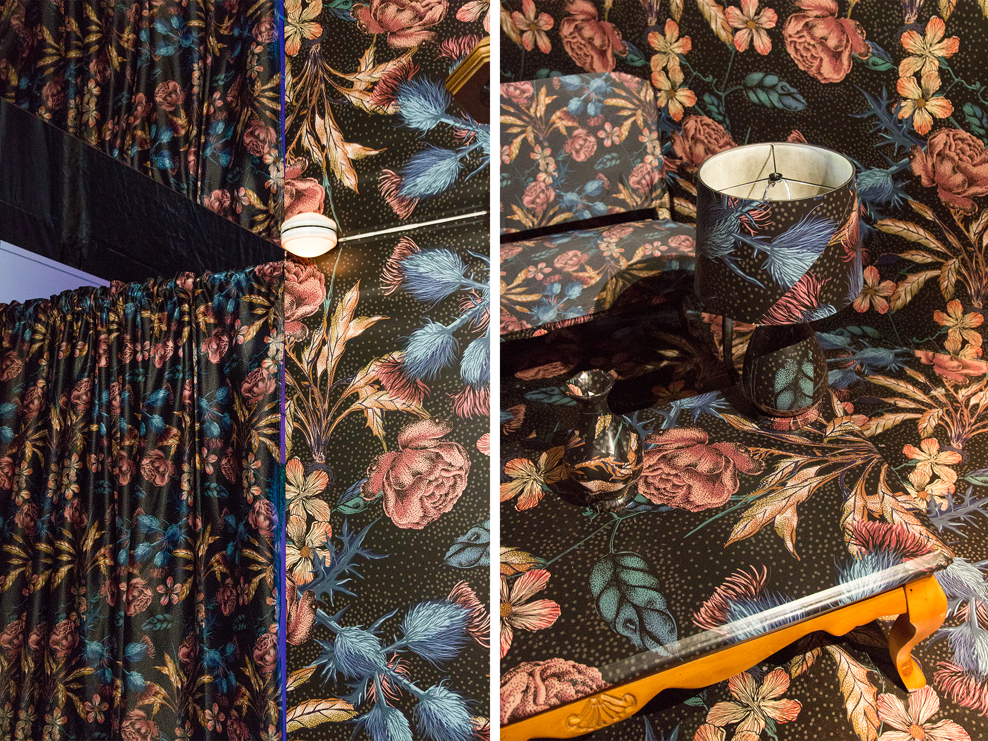
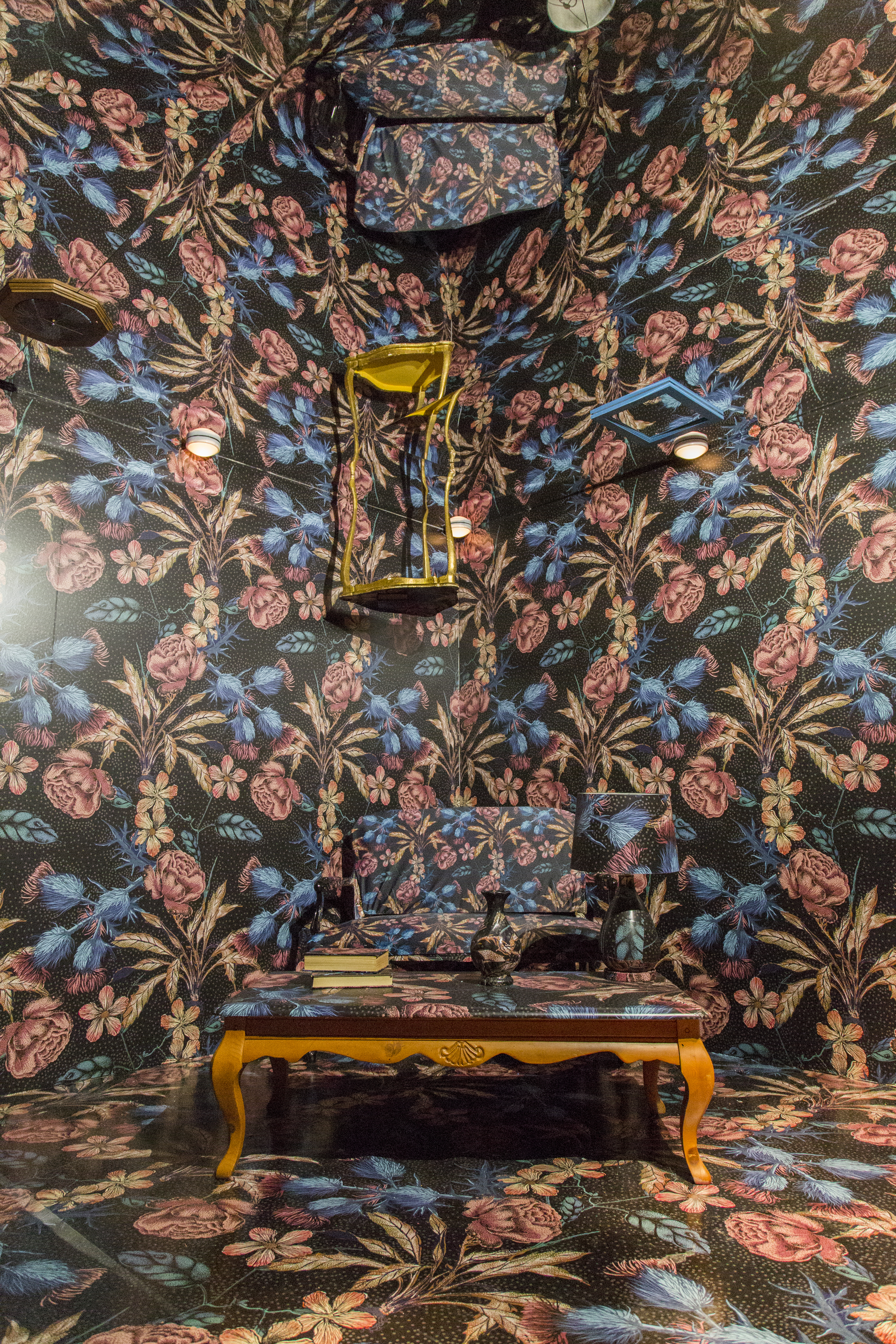
We approached this trend with a darker and more unexpected take on floral. Just as our own ideas of “modern romance” don’t perfect align with mainstream representations, we sought to express the trend by prioritizing optical illusions while still maintaining elements of whimsey.
While the trend could have been approached in a more romantic way, we saw a larger opportunity to illustrate texture through graphics, materials and scale, instead of focusing on the object (flowers) themselves. In this room, the interplay of digital or simulation responds to the concept of “modernity”.
Creative Direction + Design: Kastor & Pollux
Graphic Design: Dani Roche
Production + Fabrication: Diamond
Portrait Photography: David Pike
