Build
20+ Pictures From The Ultimate Selfie Station
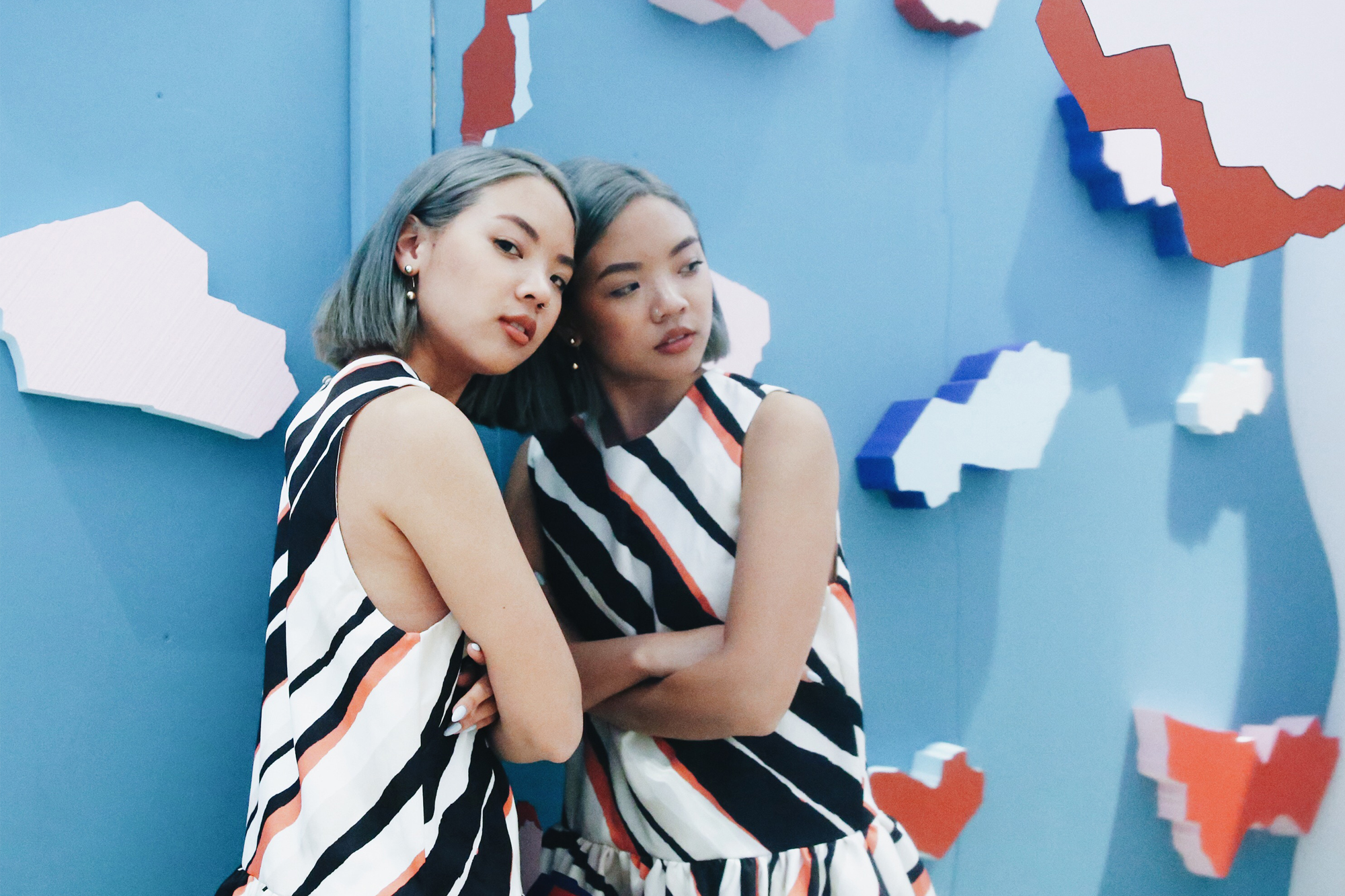
“The Ultimate Selfie Station” was borne from stigmas surrounding public selfies. Even though Instagram has catapulted self-documentation to new and “acceptable” levels, the concept is still foreign to many people who are unwilling to understand the platform as one that could be optimized for aesthetically-sound visual documentation.
Long are the days of yellow-toned Instagram filters and the confines of square crops: Instagram has encouraged the average Joe to be constantly on the hunt for the perfect #OOTD wall. In the past few years, Instagram “savants” have built a culture around getting the perfect shot – continuously “supporting” anything/everything related to that ubiquitous pink Paul Frank wall, Maya Hayuk’s colourful murals, and the art in any modern art gallery in a 10km radius. Beyond that, the app has popularized the word “aesthetic” outside the confines of an art school classroom, and everyone from my cousin to my “ex’s” mother (who recently called me asking how to “Insta-plan”), are deeming themselves “feed-conscious”.
These tropes typify Instagram – and I have never been adverse to play into said tropes.
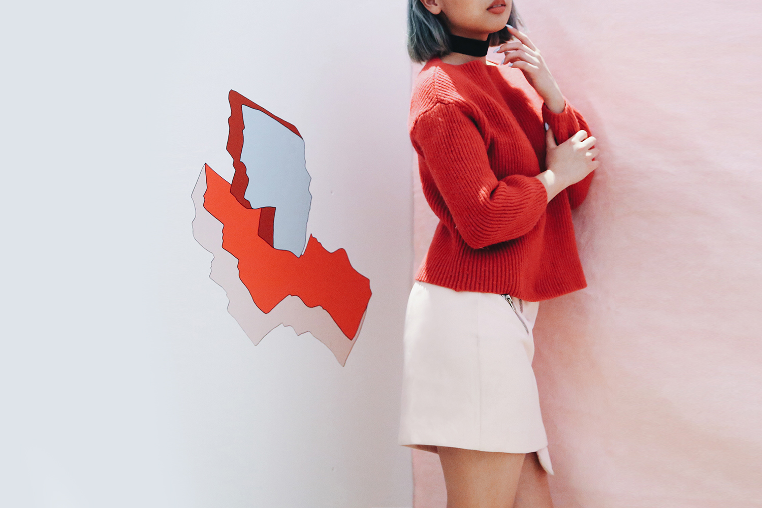
As I touched base on in my previous post, public “art” is tricky territory. This main objective of this project with Scarborough Town Centre was to create a tactile experience that would encourage audience engagement: and in my eyes, a foreign space in a familiar location was a huge statement that would answer said objective. While defining an “art piece” as a “selfie station” may seem like a grey area, the points of intersection between art and commerce have already become so blurred with the commercialization of everything/anything [on Instagram] – so a project like this seemed like a sensical, palatable, and positive transition, and an accessible and inclusive solution to boot.
As someone with years of experience “wall-hunting” – phone in hand, ready to pull out a basic fashion blogger pose at the click of a switch – this project essentially allowed me to design my ideal photoshoot space. I created something that felt like a dream to any content-hungry/Instagram-obsessed millennial, including myself.
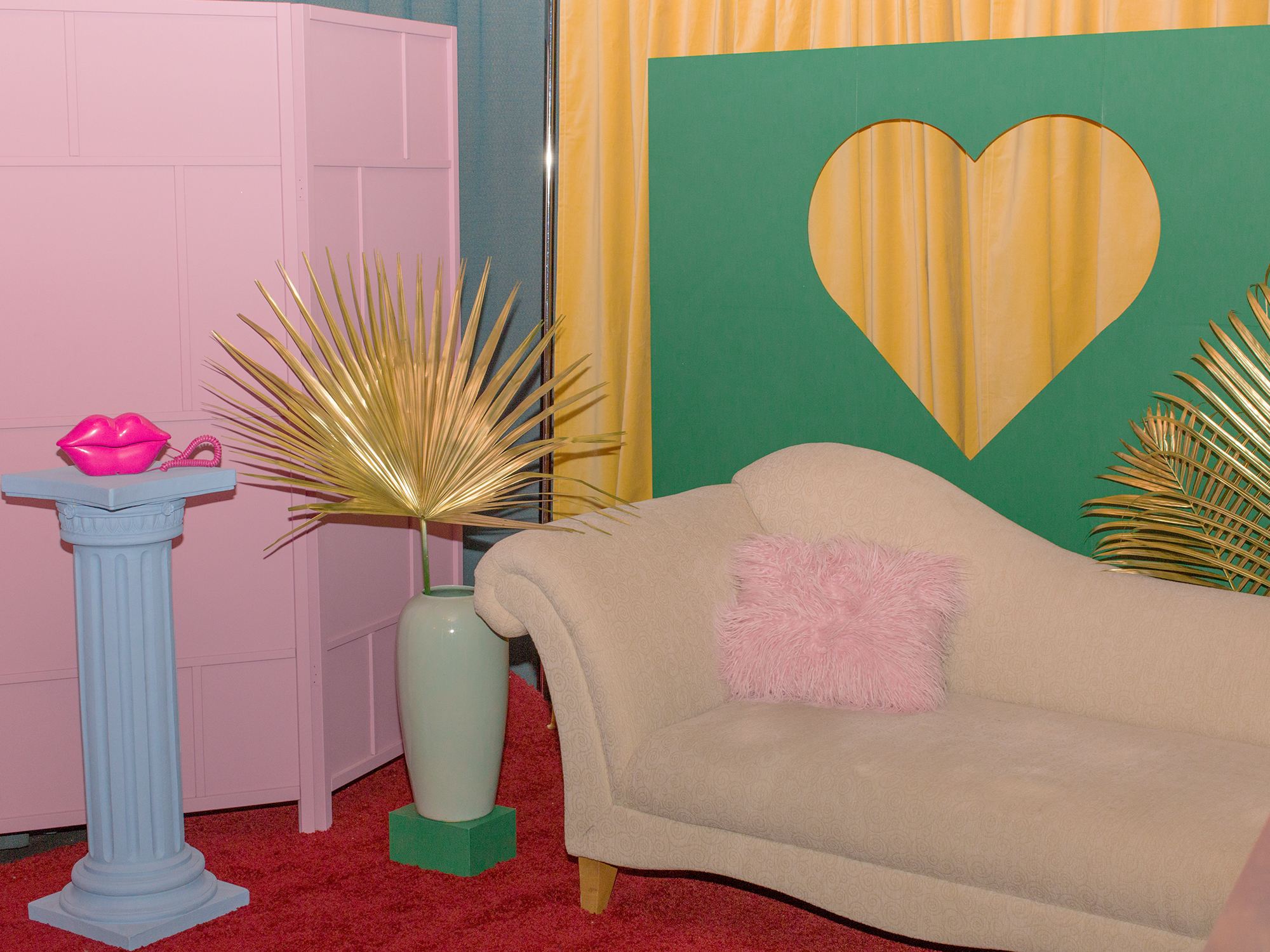
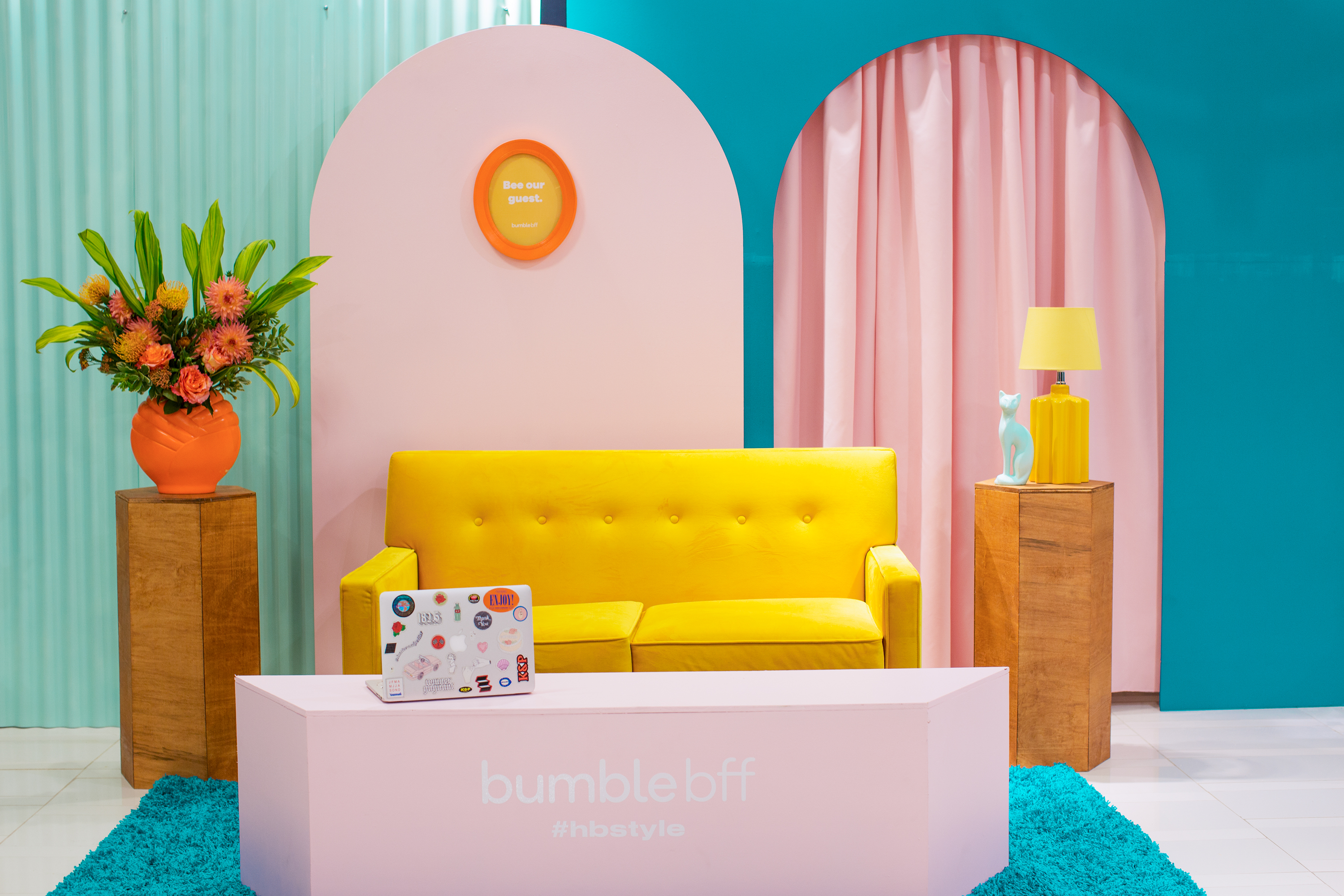
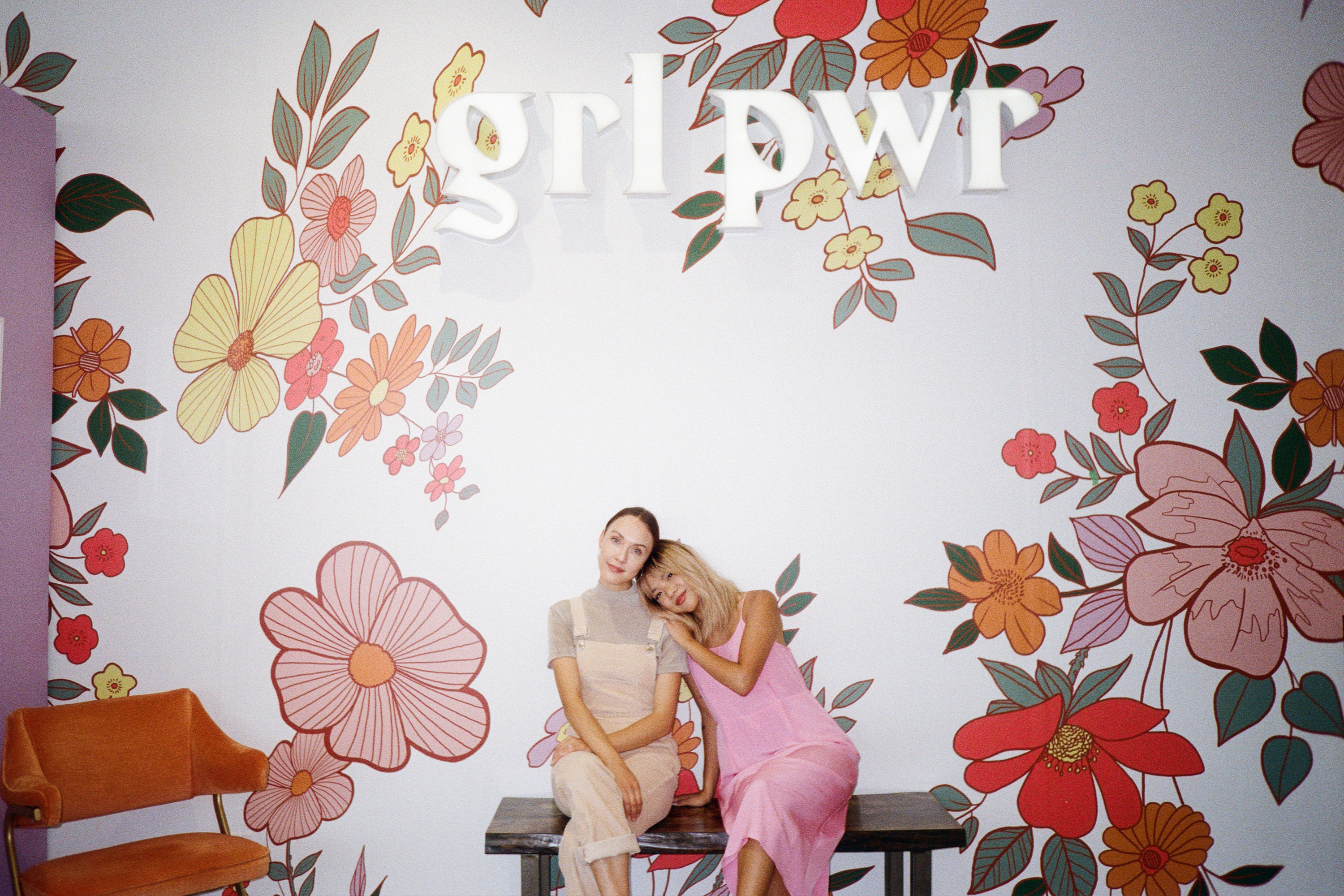
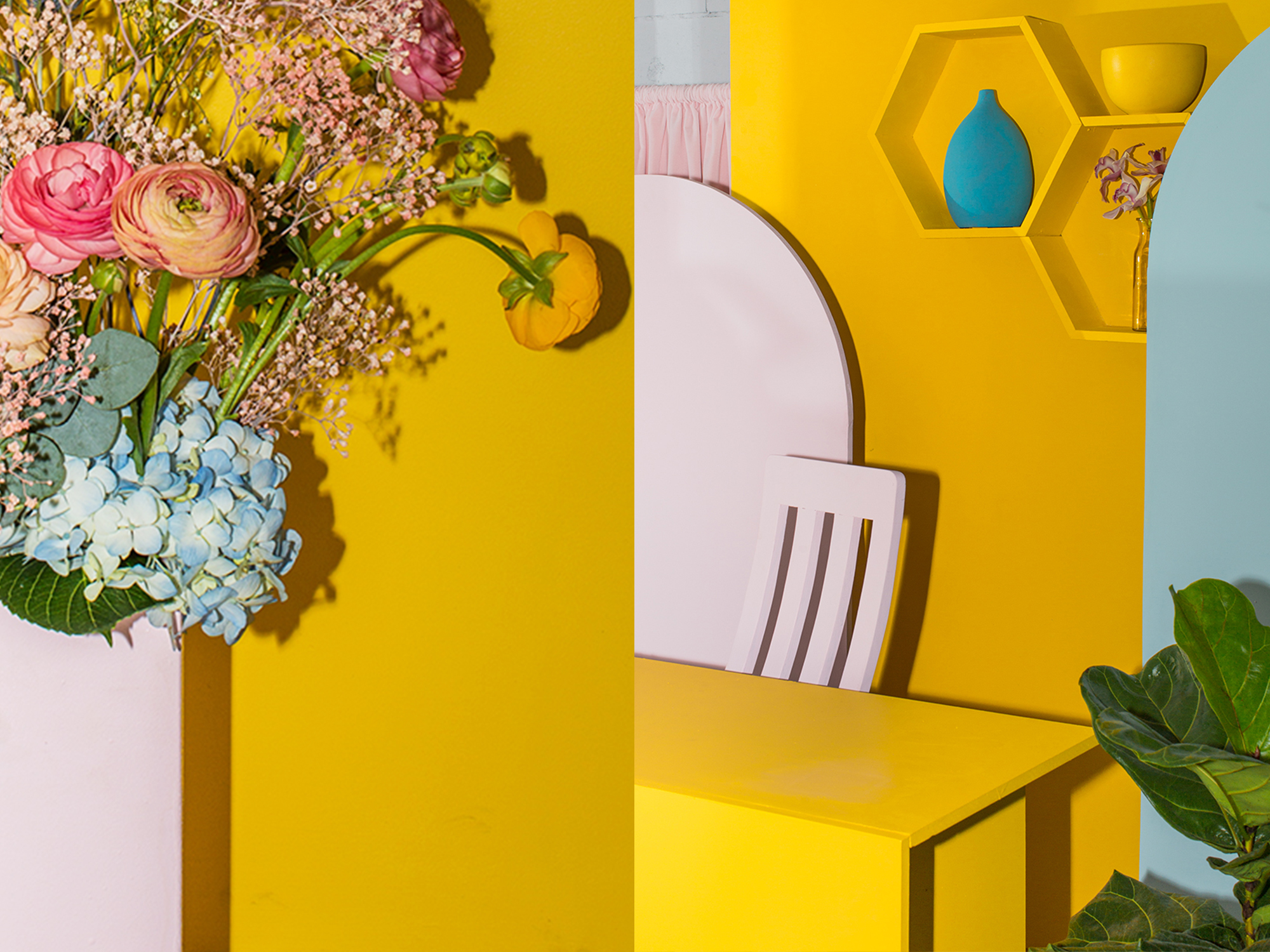
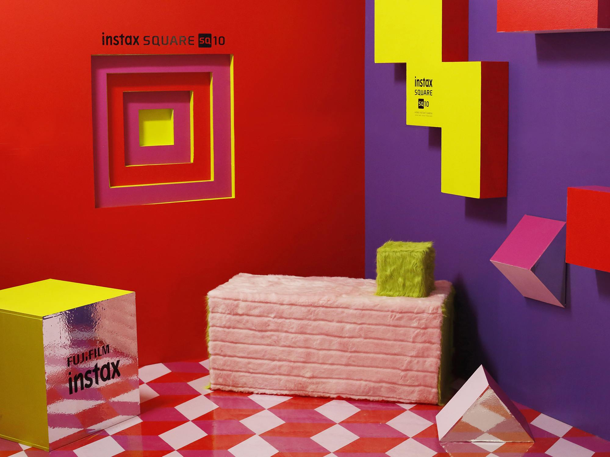
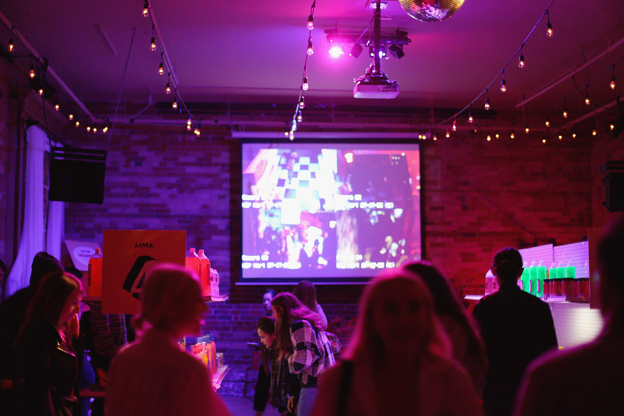
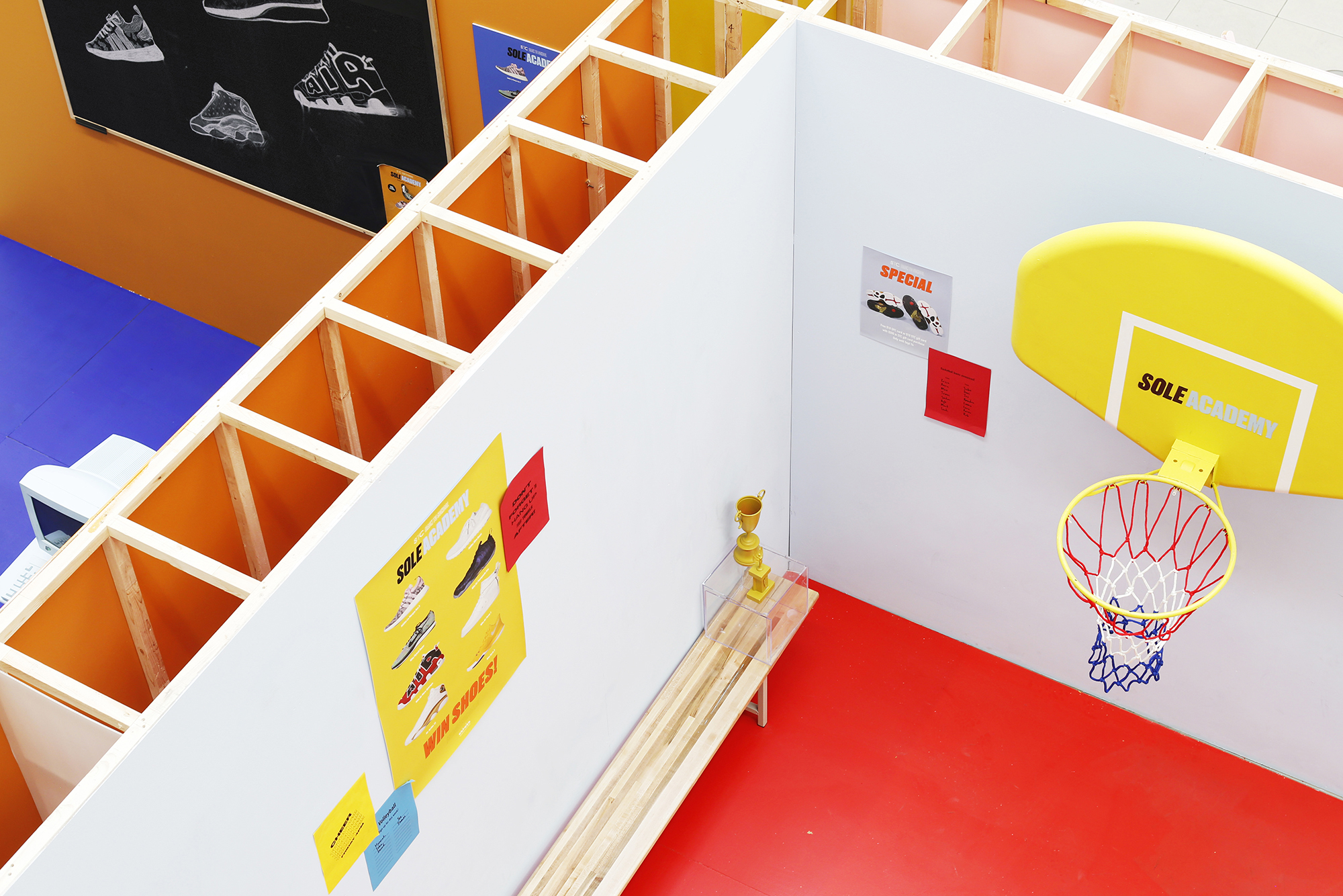
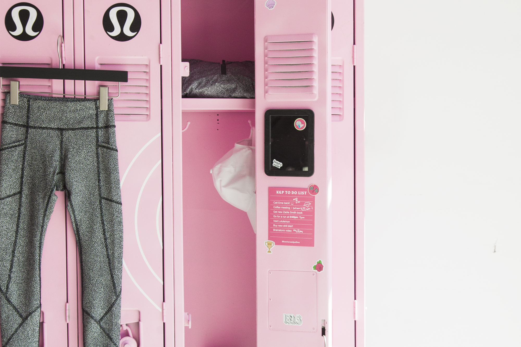
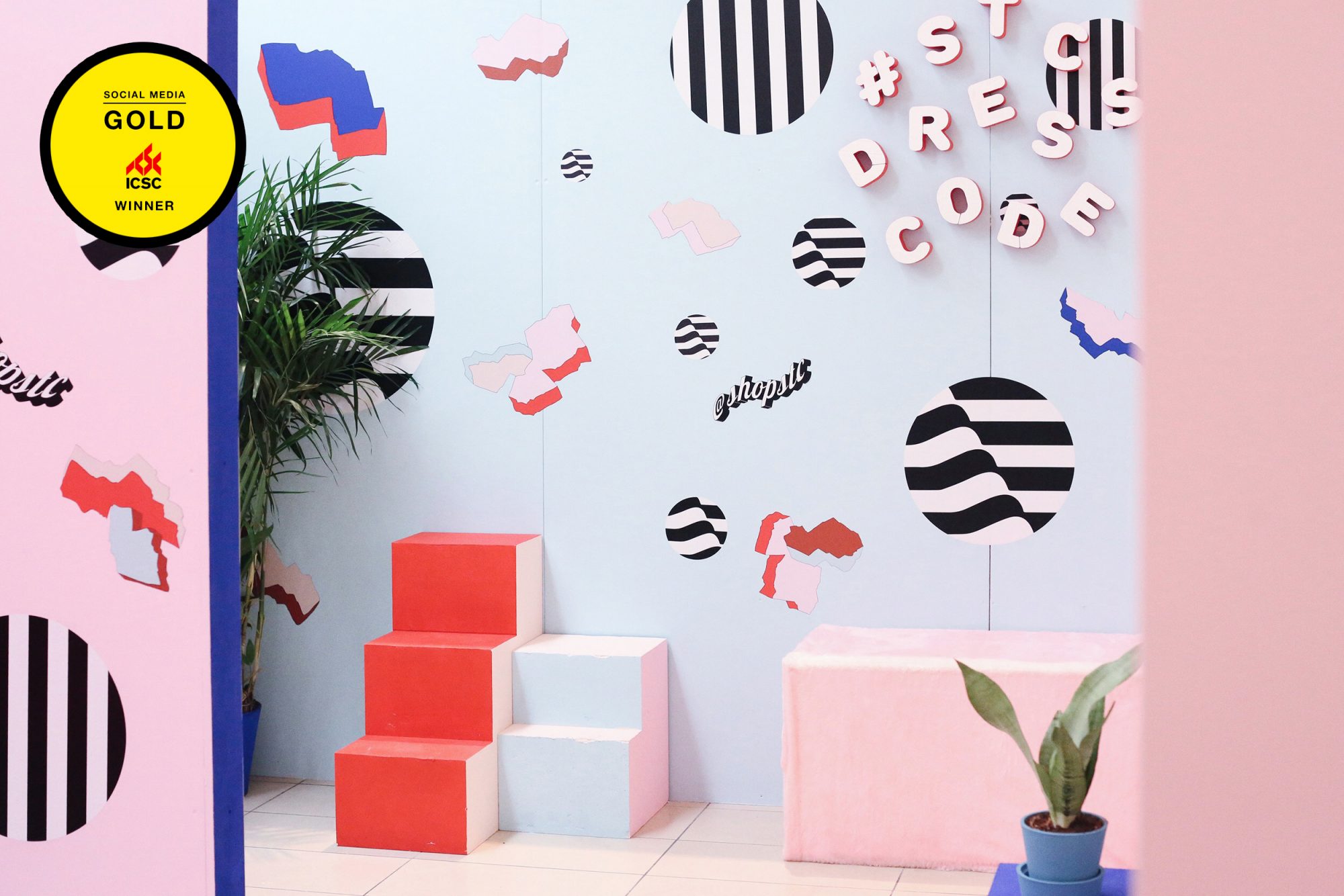
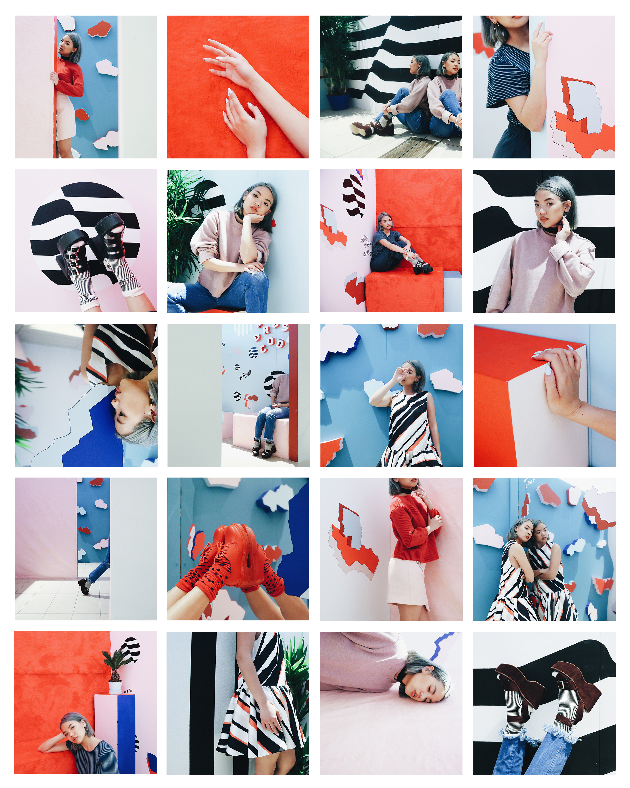
The 200sq ft space – filled with plants, prints, mirror, multi-dimensional objects etc etc – ensured that with every wall intersection, a new photo op would be made. Whether sitting, standing, leaning, perching, the photo set (above) definitely leads by example – demonstrating that there is no shame in existing in a space that pretty much begs for an audience.
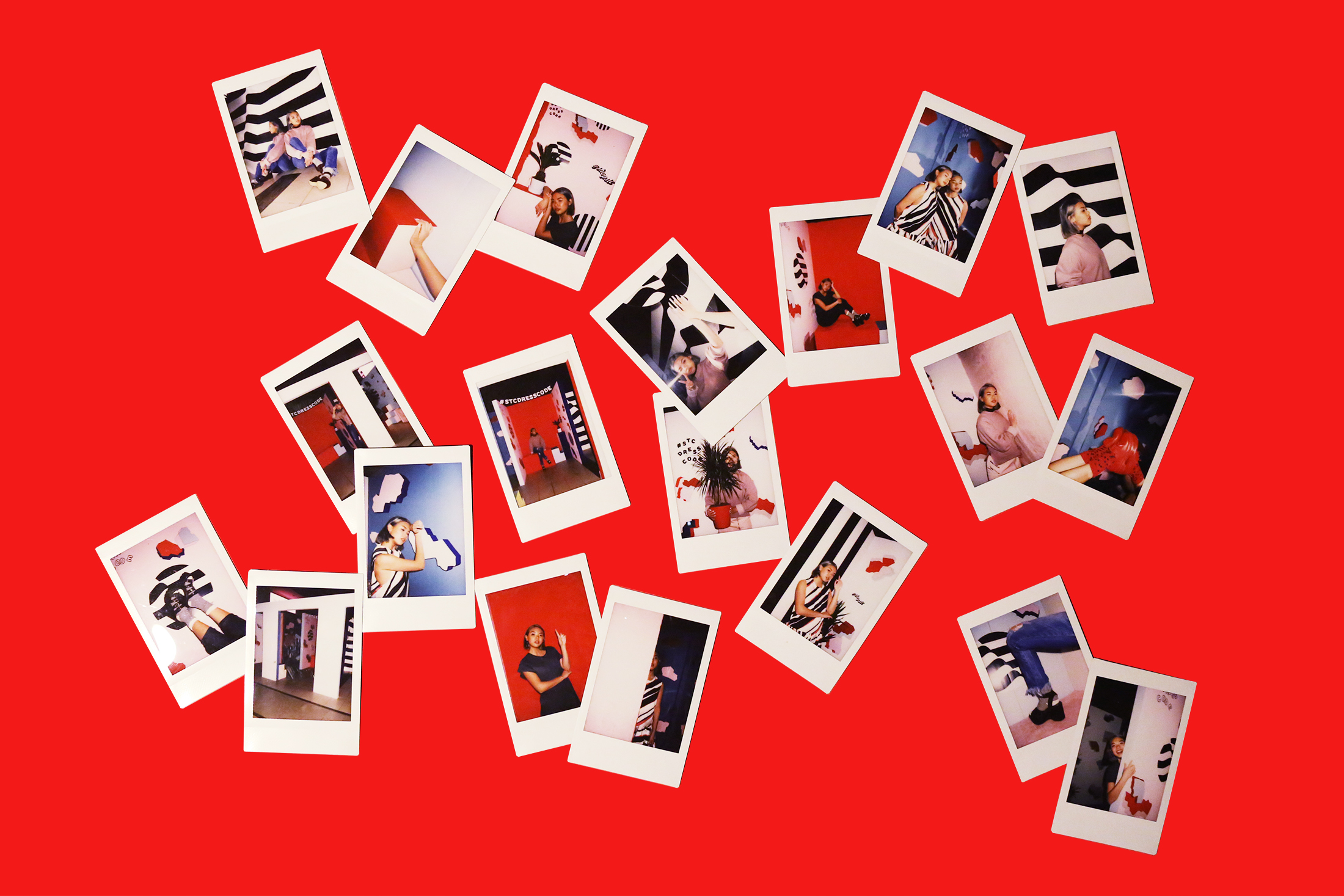
While the installation is no longer available, I now have an endless roster of content for all my channels, an extensive amount of documentation, and a populated hashtag that backs up the fact that the proof is almost always in the pudding: provide a photo op and people will take it! To everyone who made it out to STC to check out the installation – thanks very much! I hope you have content for days and days and days.


