Build
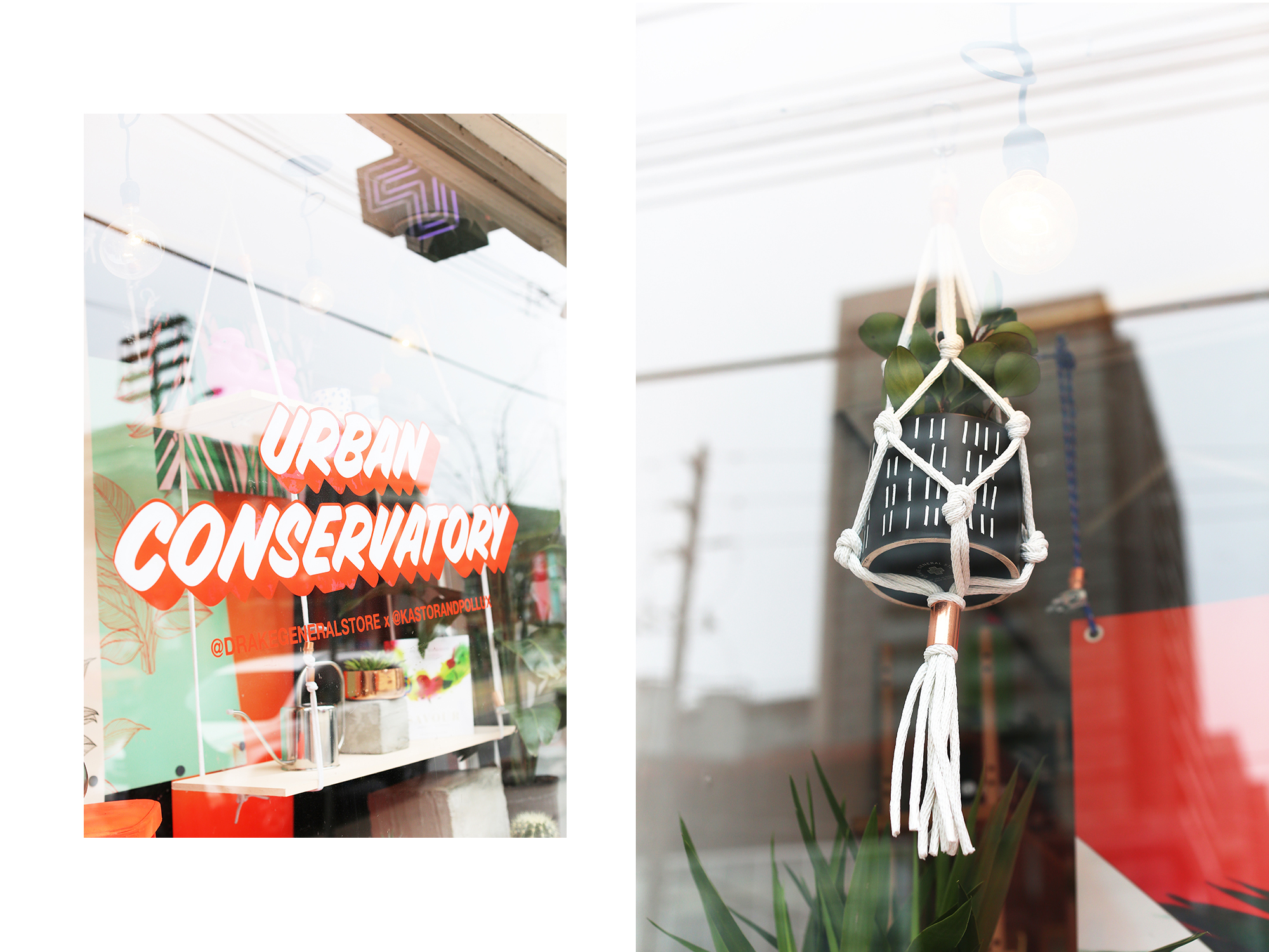
Plants Are Power: Urban Conservatory Window
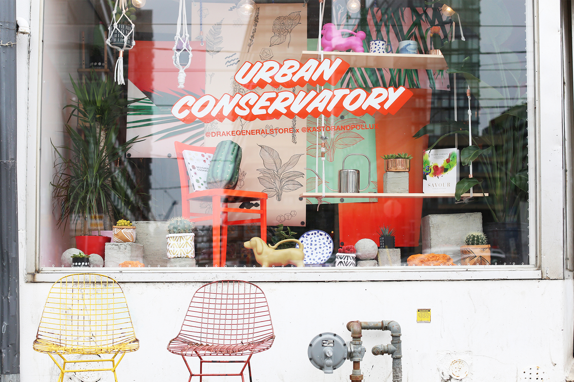
The Drake General Store has been a long-time West Queen West staple; a hub for all things kitschy and cool. Long before I was walking distance from it, I regarded the ever-evolving window displays to be some #fine pieces of work. While the brand has expanded its reach over the past few years (it’s now found in the Hudson’s Bay Company in Ottawa and Vancouver, and has a few standalone locations in Toronto), the flagship store on QW continues to shine bright.
Might be hard to believe, but the Drake General Store came long before Drake put Toronto on the map (but maybe he will still see my window!!). The hotel originally opened in 1890 with the name D.A. Small’s Hotel gaining its namesake in 1949, and expanding from hospitality to creating a timeless centre for arts and culture. In 2008, The Drake General Store opened its doors to serve the community in a myriad of ways. By combining the traditional concepts of flea market, museum shop, and the classic general store, DGS has created an environment that facilitates nostalgia and whimsy, providing people with a multifaceted experience.
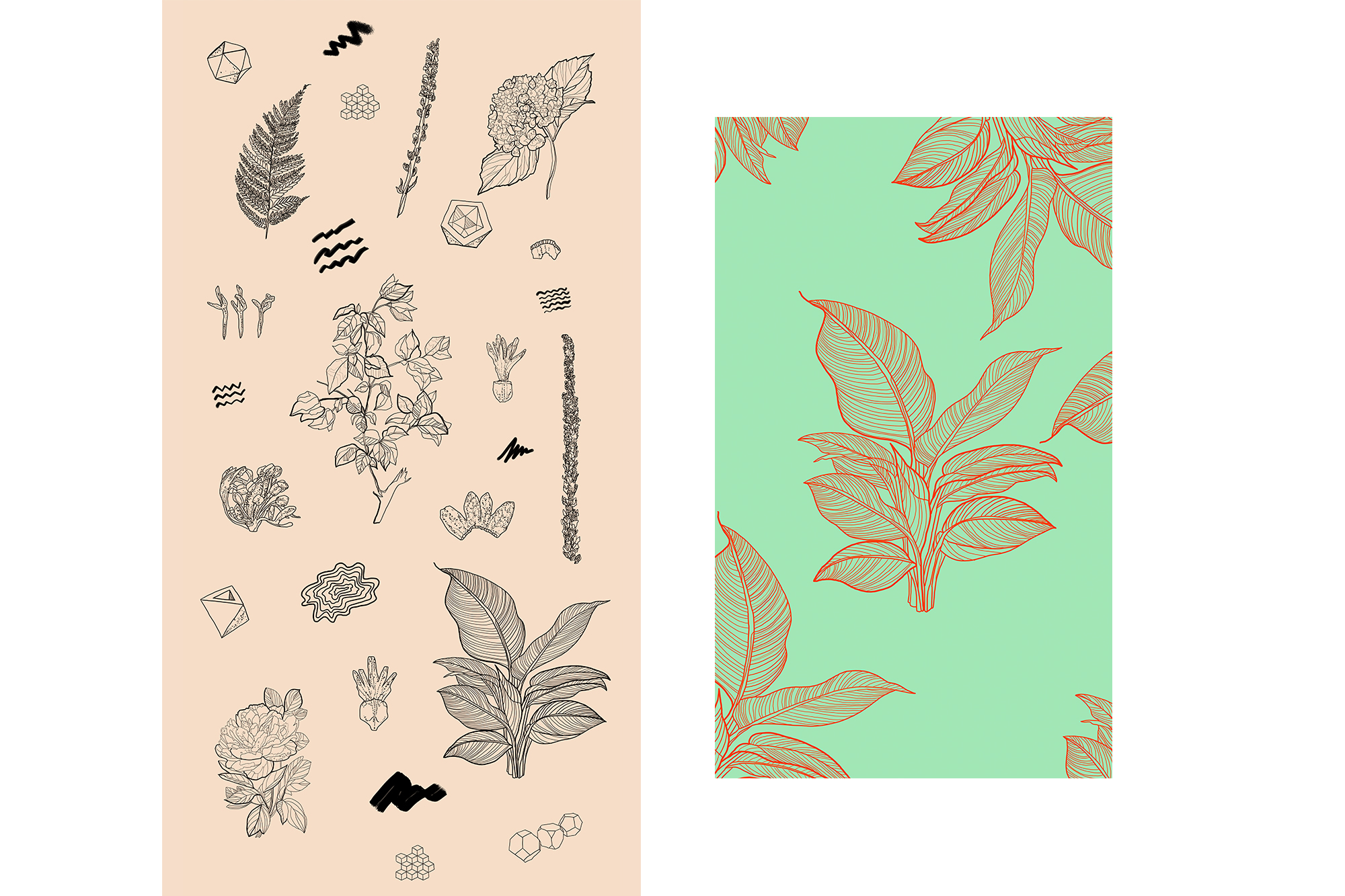
Kastor & Pollux is built off the idea of creating experiences: as a whole, we thrive off of exploration and collaboration. I, personally, am someone who fears isolation and monotony in my professional life – and I’ve come to realize that I feel the most rewarded when I’m learning something new and working with my friends. This collaboration with DGS allowed me to do both of these things, so it was pretty much a win-win lol. Shoutouts to the entire DGS team for being amazing to work with, and shoutouts to Little D (Dani Reynolds) for being endlessly on her A-game!
A big part of collaboration is recognizing your weaknesses, and understanding that stepping back and letting someone else do the work is fine. I’m super Type A – intense, overbearing, and bossy. But whenever I’m working with Dani Reynolds, I know when to chill and step back and watch her work her magic.
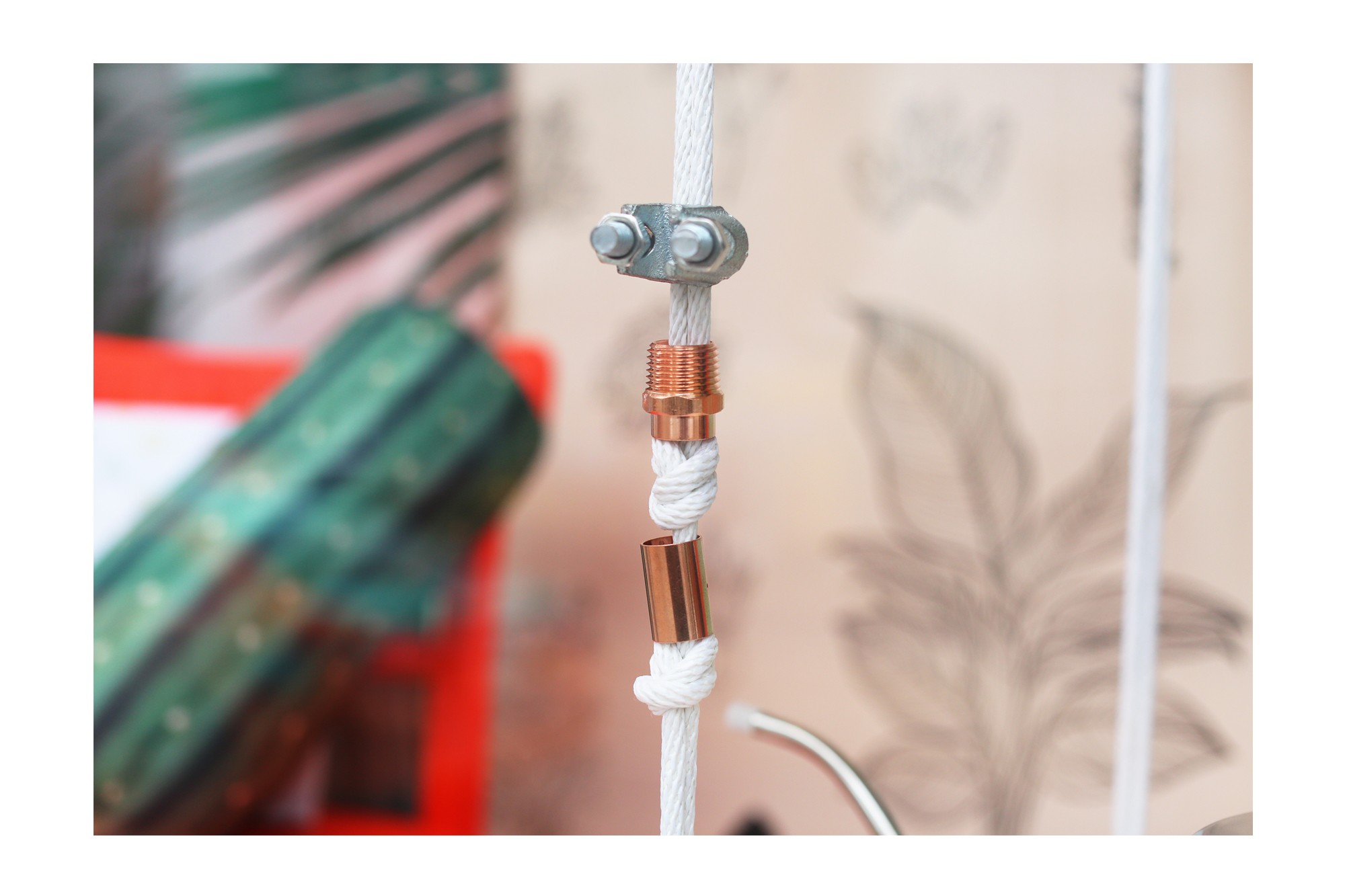
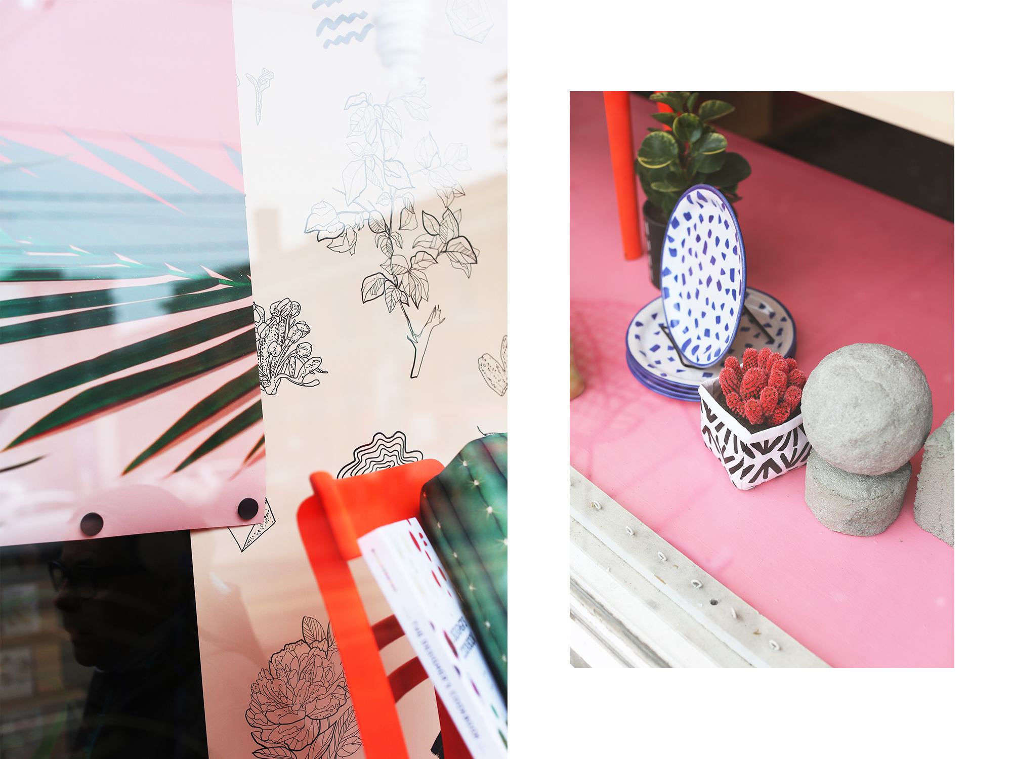
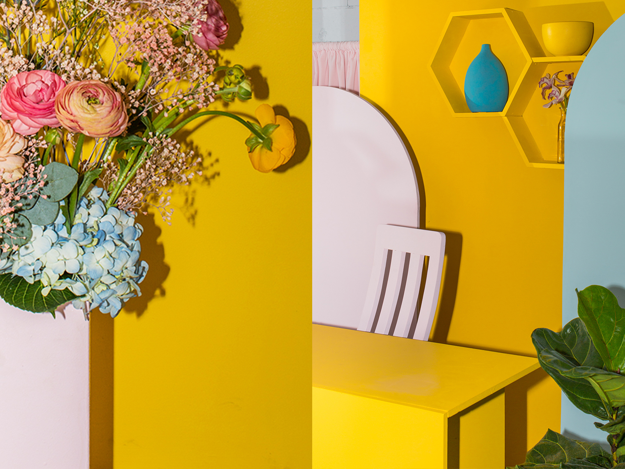
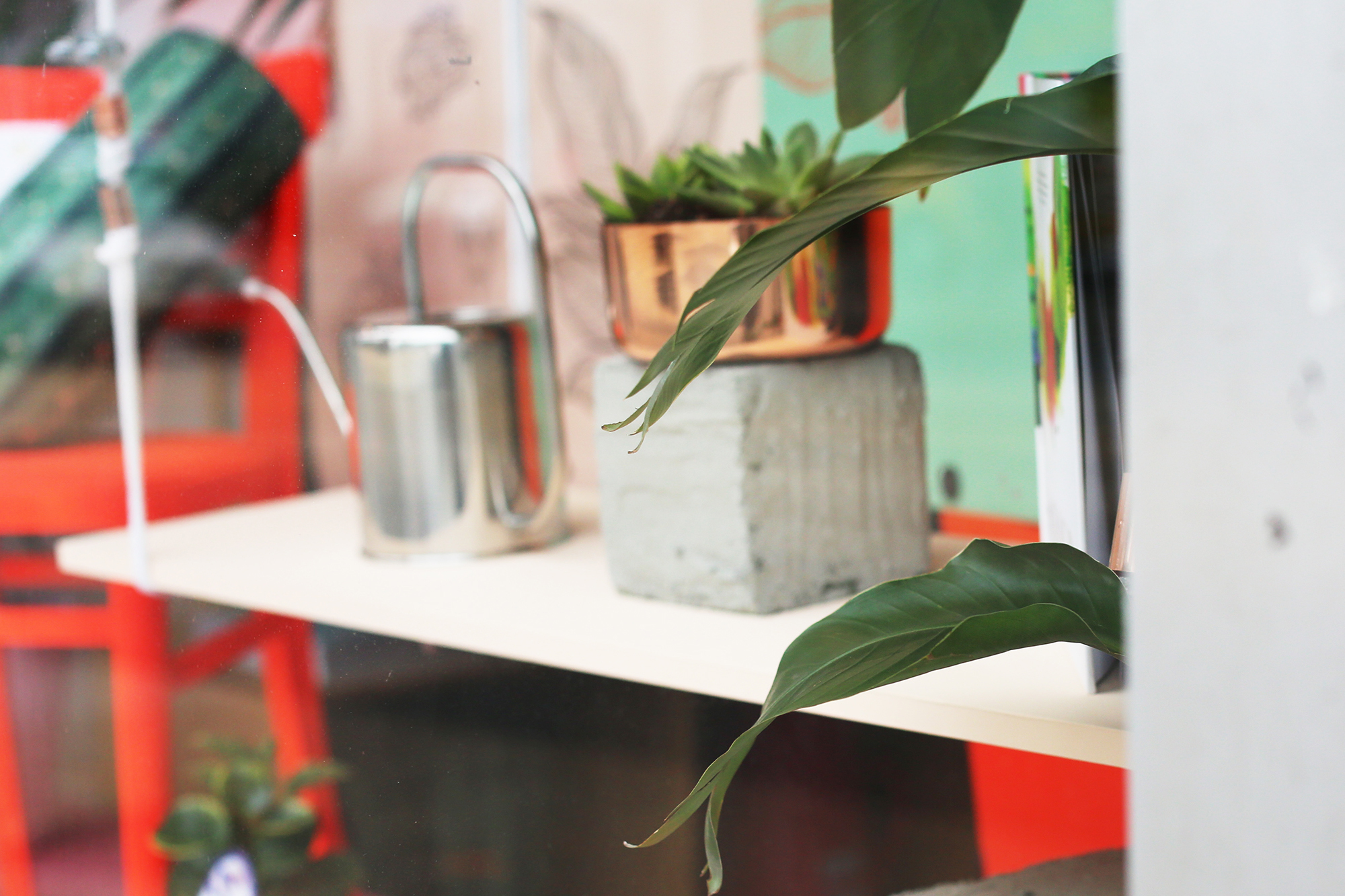
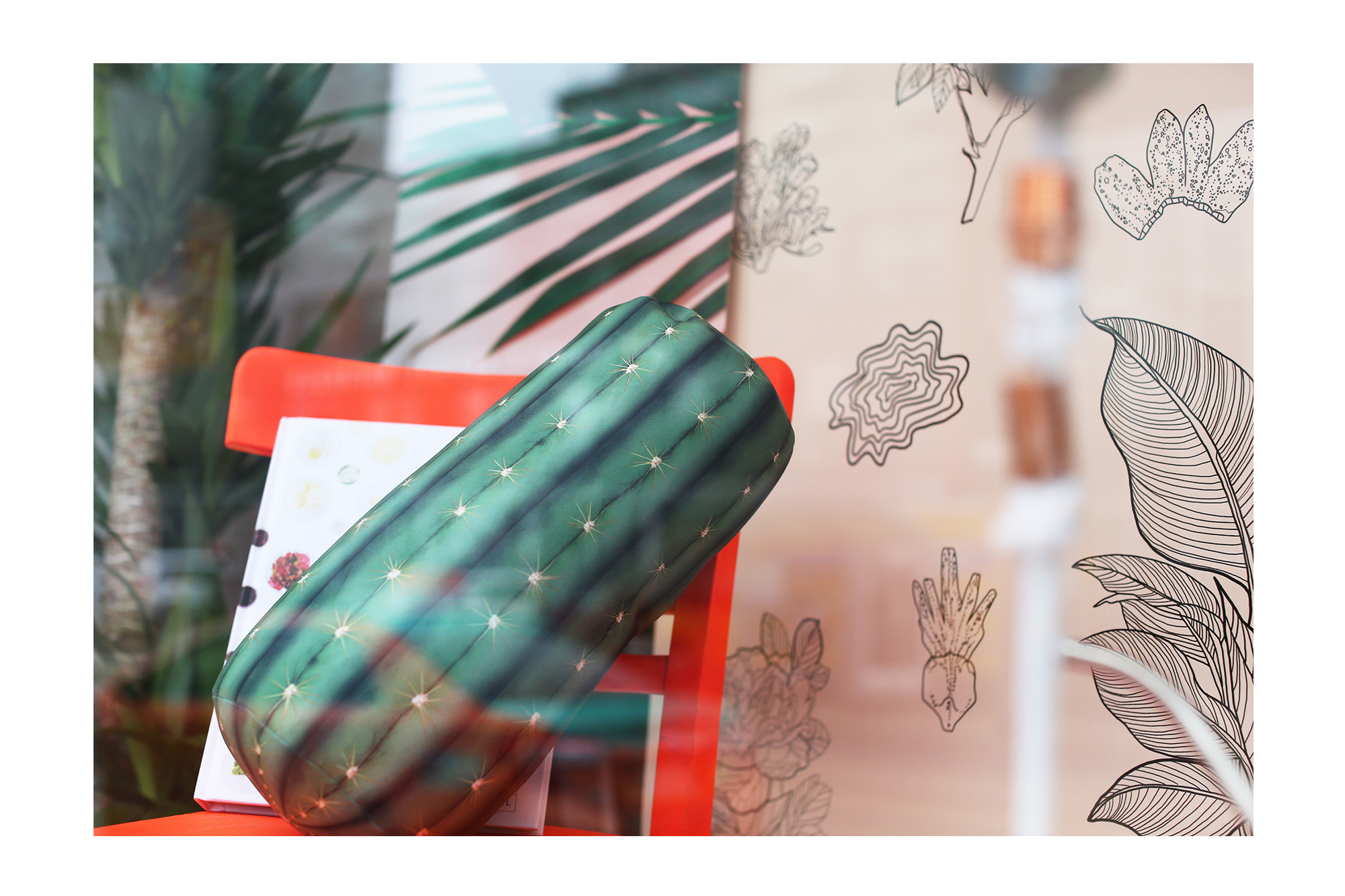
This window was a product of my eagerness to apply my skills to new mediums, and also a recognition that I couldn’t do it alone. Before this project I had no prior experience in regards to window displays – but as with anything else I do, I kind of made it up as I went along. Pushing pixels around on Illustrator was a big part of this project, but aimlessly perusing Home Depot followed immediately after. Generally, design is very process-oriented. Once you solidify one element, everything else just follows suit. A window display obviously serves a purpose, and following a check-list of objectives is just as important as what the end project looks like aesthetically. When all the elements feel right together, and those objectives are successfully met, it’s just about scaling everything to translate perfectly from digital to real life.
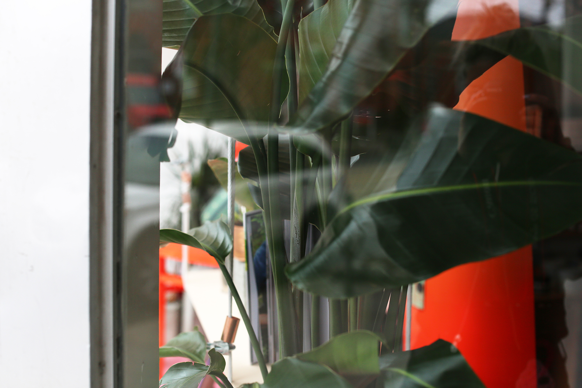
I talk about this a lot, but I feel like when you’re a (relatively) young creative trying to figure out *what* *exactly* you want to do, the only way to truly make “progress” is to just try everything and anything. I feel like a lot of opportunities are afforded by just putting your work out there – and while this is often Pee-Inducing Scary, it’s an integral way to figure out what works and what doesn’t work, and what you want to do more of and what you never want to do again.

Design + Illustrations: Dani Roche
Props: Dani Reynolds
Install: Meaghan Way
Wordmark: Amy Knaus
S/O to Kate and Jose
Visit the “Urban Conservatory” this month at 1144 Queen St W or shop for Mother’s Day gifts on www.thedrakegeneralstore.com!


