Branding / Identity
#GirlbossRally
What does power look like?
In between poster designs and typeface selections, this is a question that I stopped to ask myself. My goal – for this project and all projects that I work on – is to find mindful ways to use design as a means to convey a message and create an approachable dialogue. Growing up, I thought that being a good designer was dependant on making things look beautiful. As I’ve gotten older, I’ve realized that it has the capacity to do so much more.
Girlboss, like Kastor & Pollux, aspires “to inform, entertain, and inspire action through the content and experiences we create”. These synergies shine through this project – knowing no geographical bounds. Created alongside Chloe Parks (Girlboss’ Art Director), this collaboration spanned from Los Angeles to Toronto and ultimately manifested in New York City.
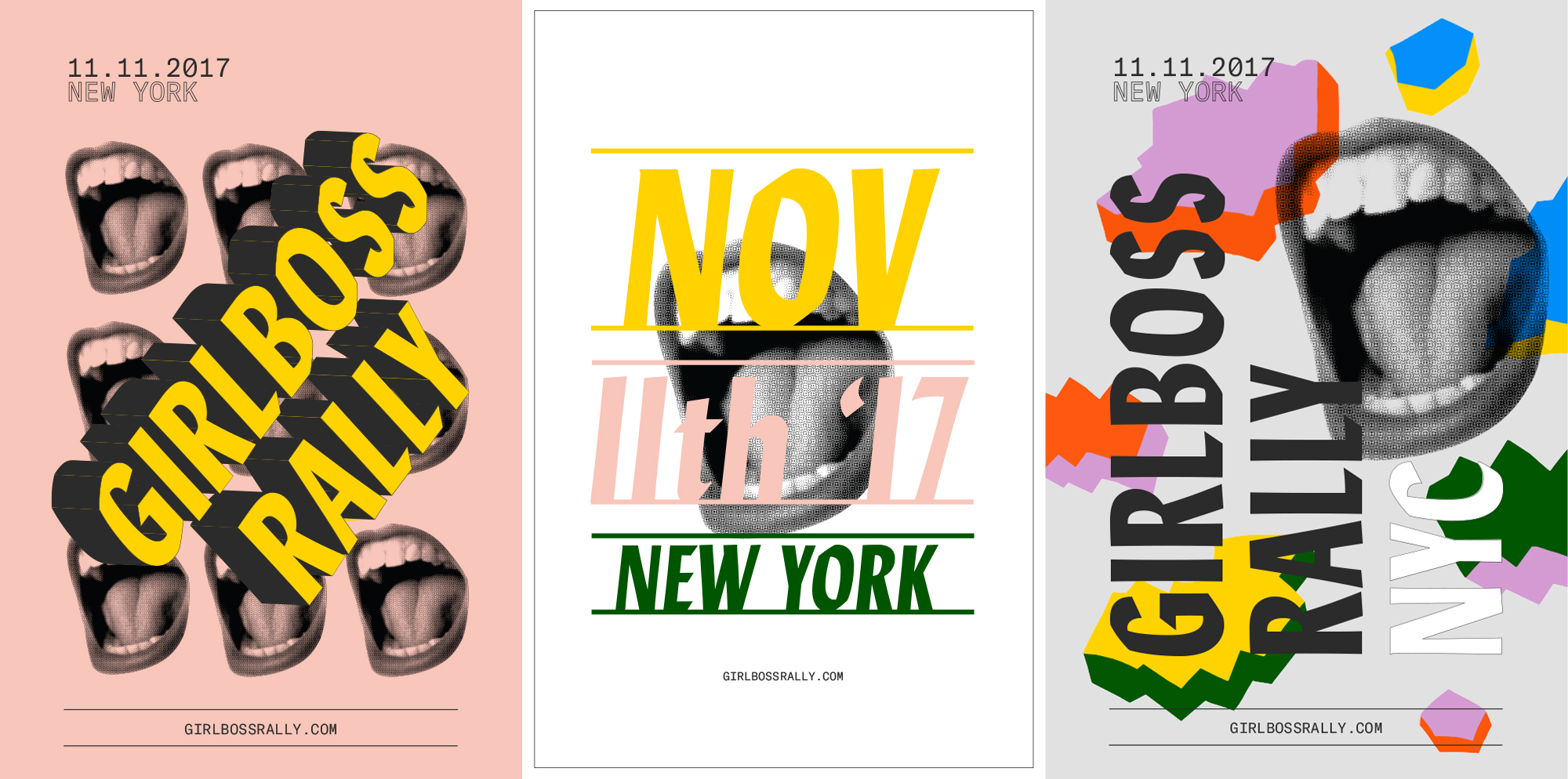
Through design and intention, we create safe spaces, support girls, and foster a shame-free, lame-free zone.
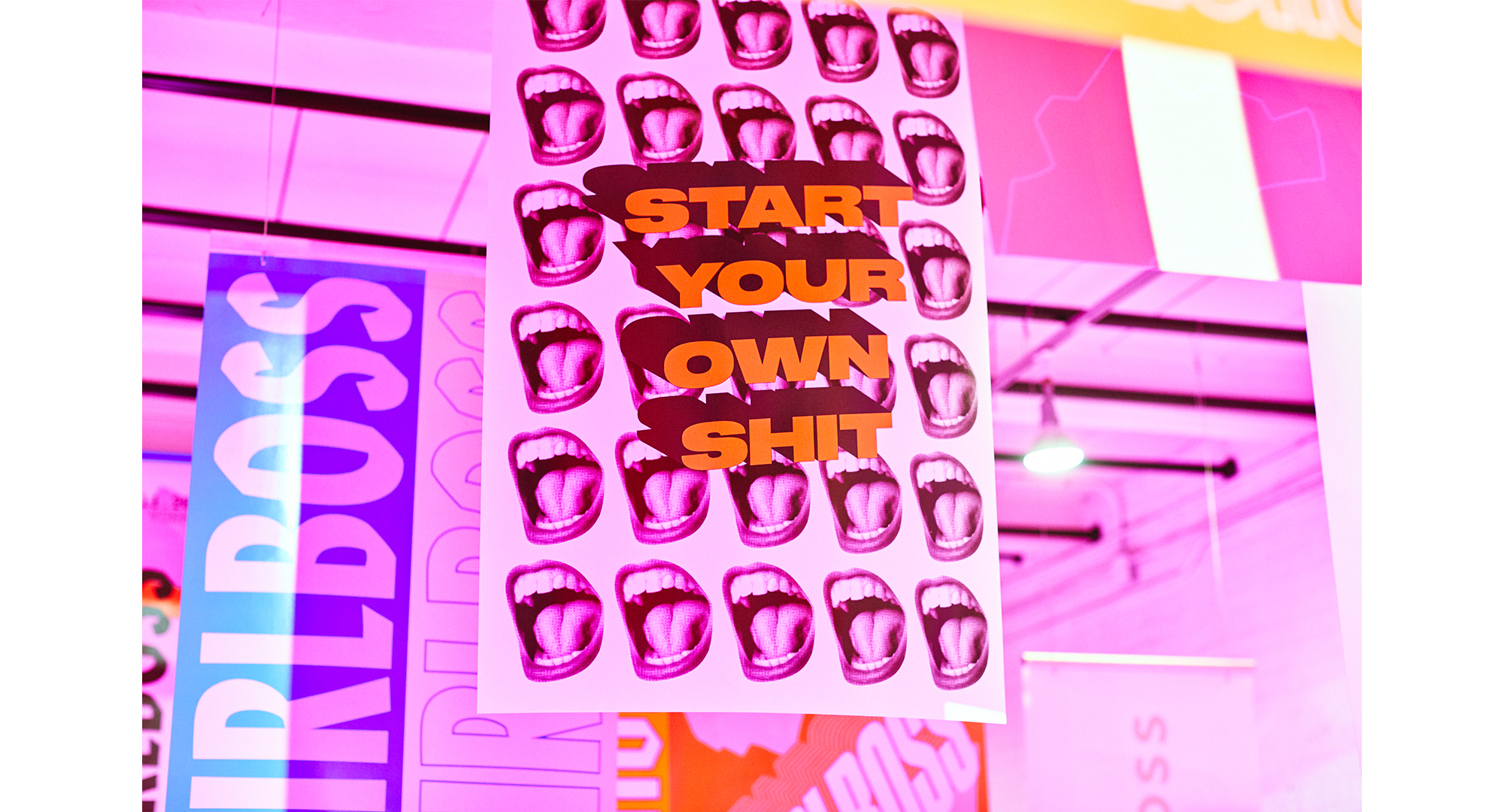
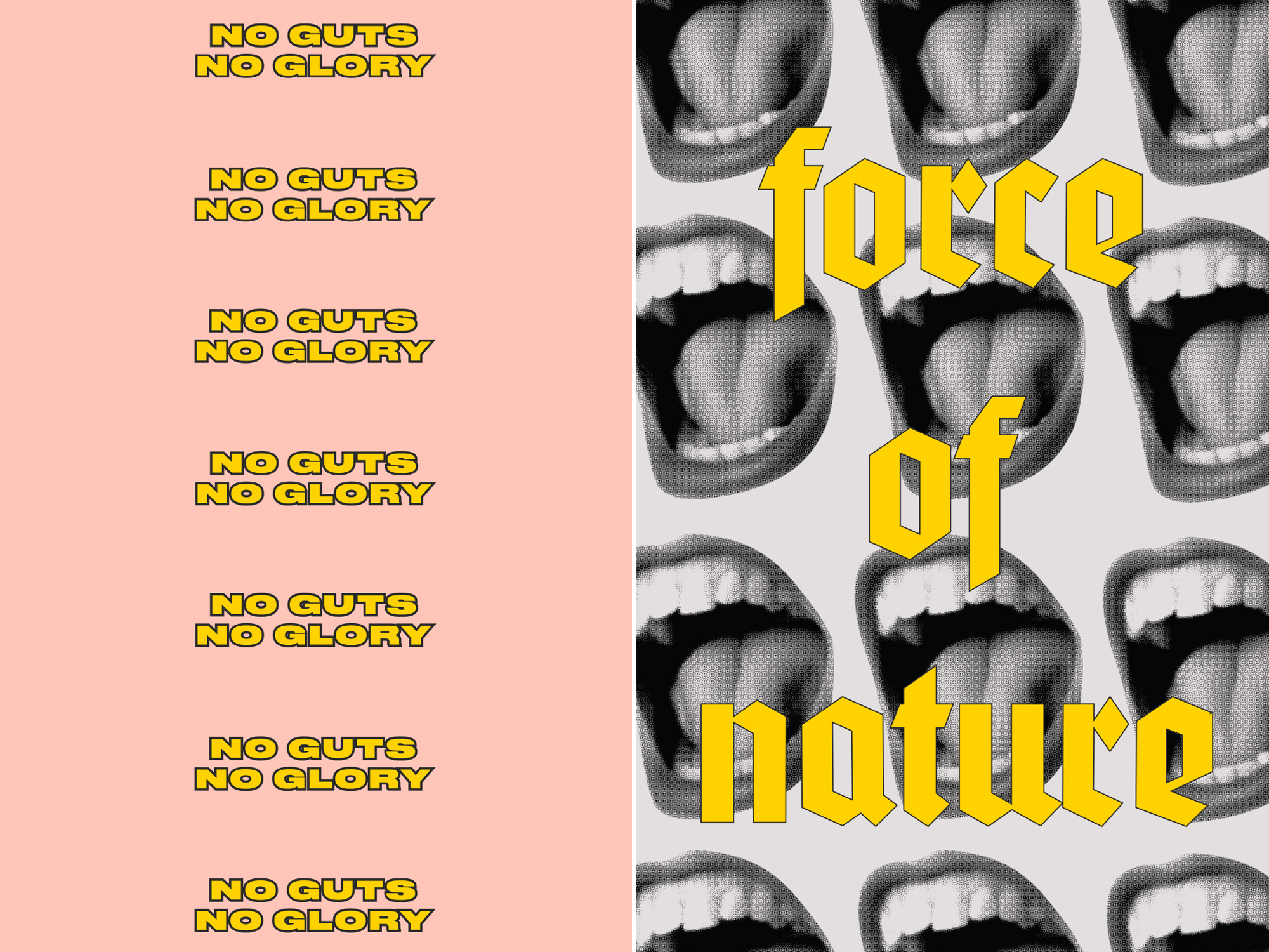
Working with an all-female team is arguably the most rewarding part of my job. I’m emboldened to see an increasing amount of platforms that present womxn with the opportunity to redefine success on their own terms, and use collaboration and communication as a way to learn, grow, and educate each other.
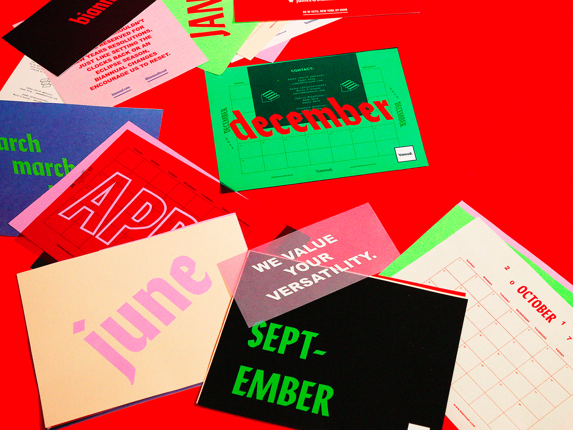
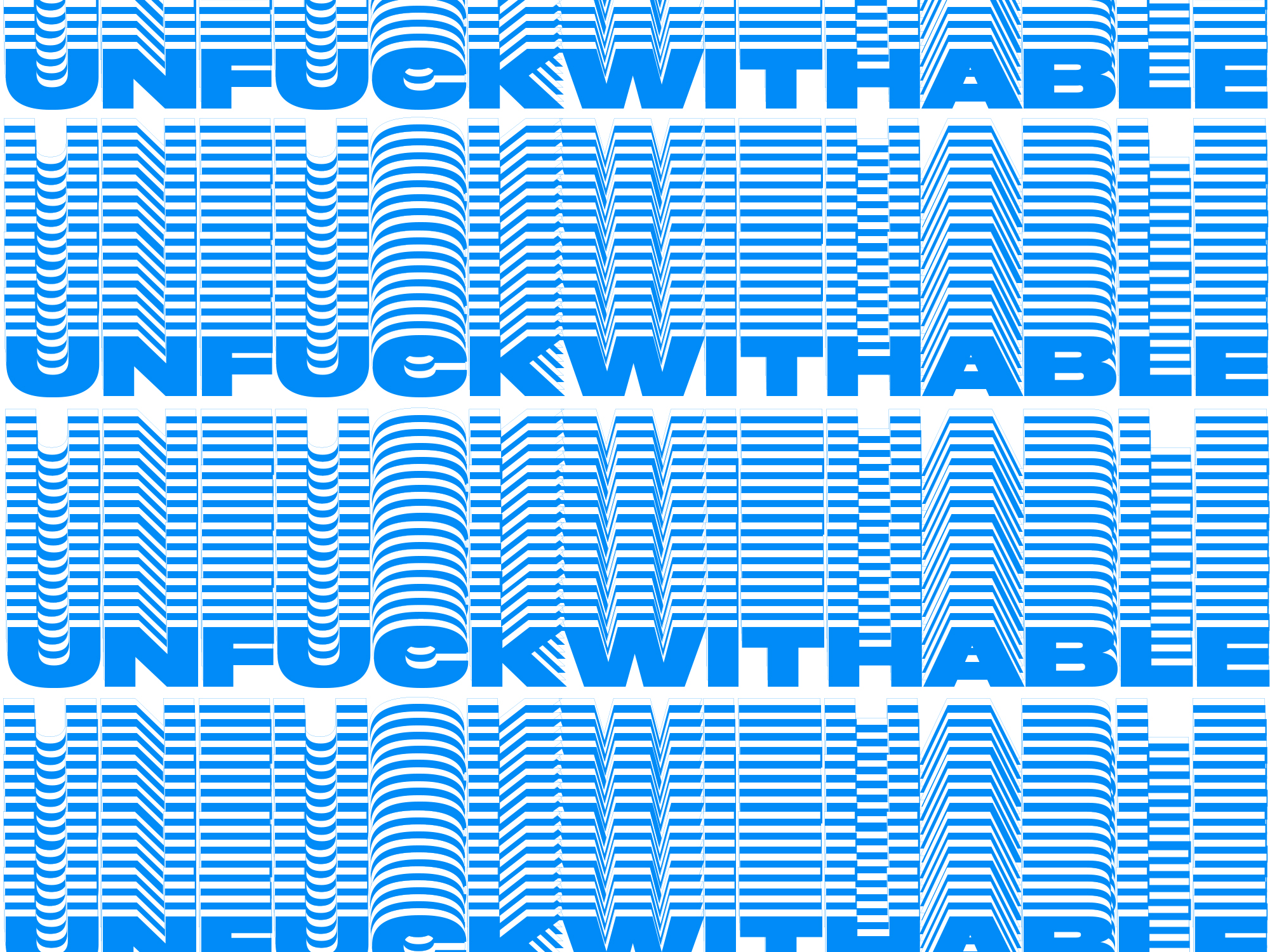
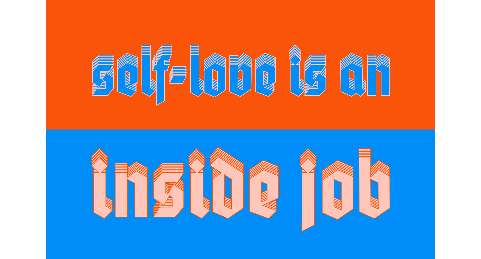
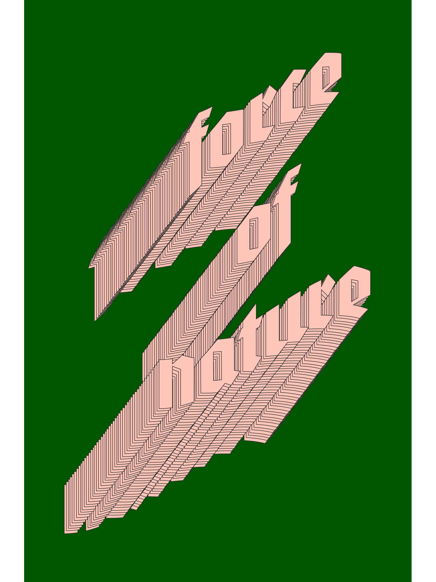
The phrases – put forward by the Girlboss team – inspired me to create bold typography that felt like it was constantly in movement. Power, to me, can take on many different forms. But I think at this point in my life, power represents the ability to move forward no matter how many adversities I feel like I’m faced with.
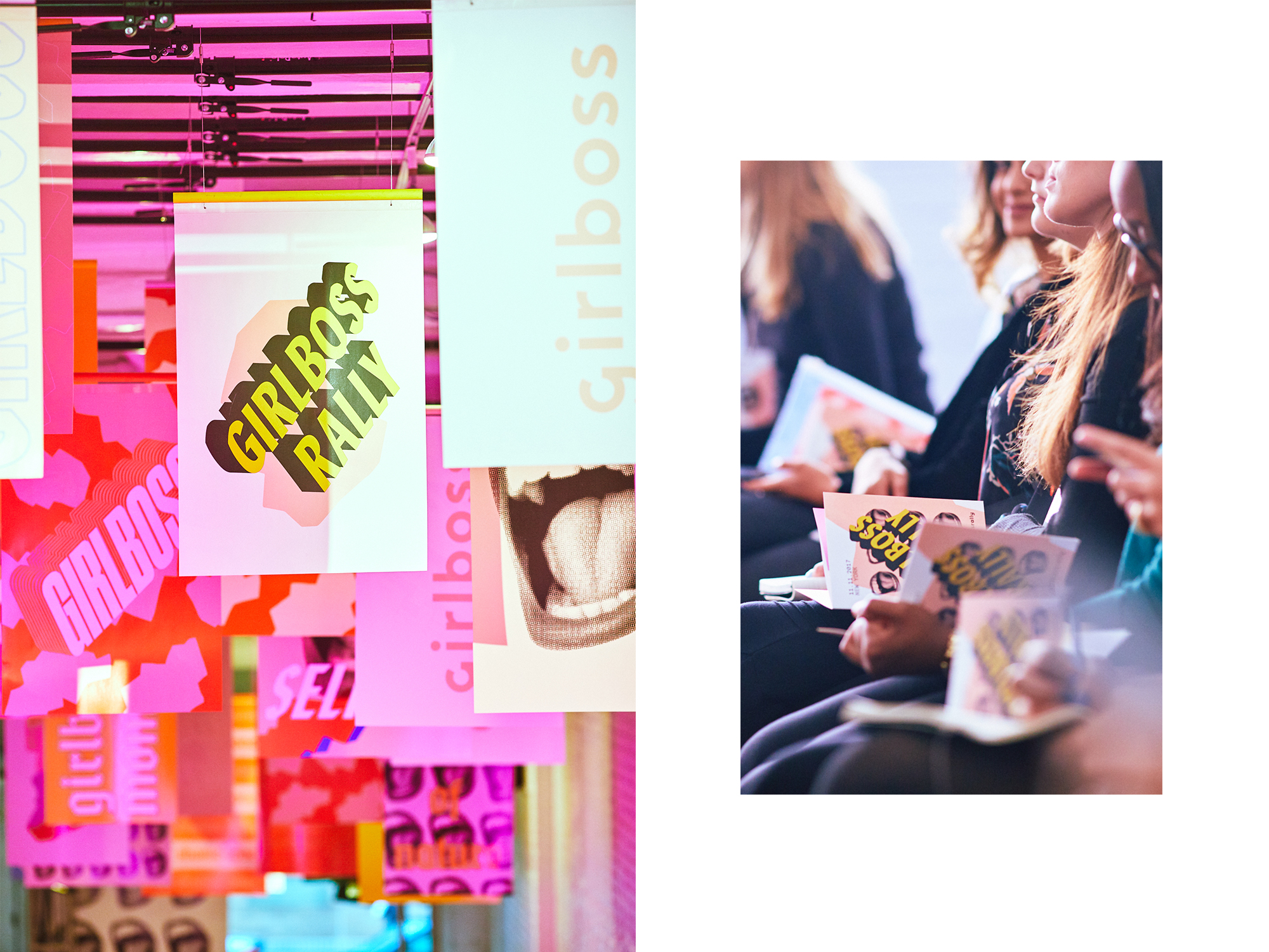
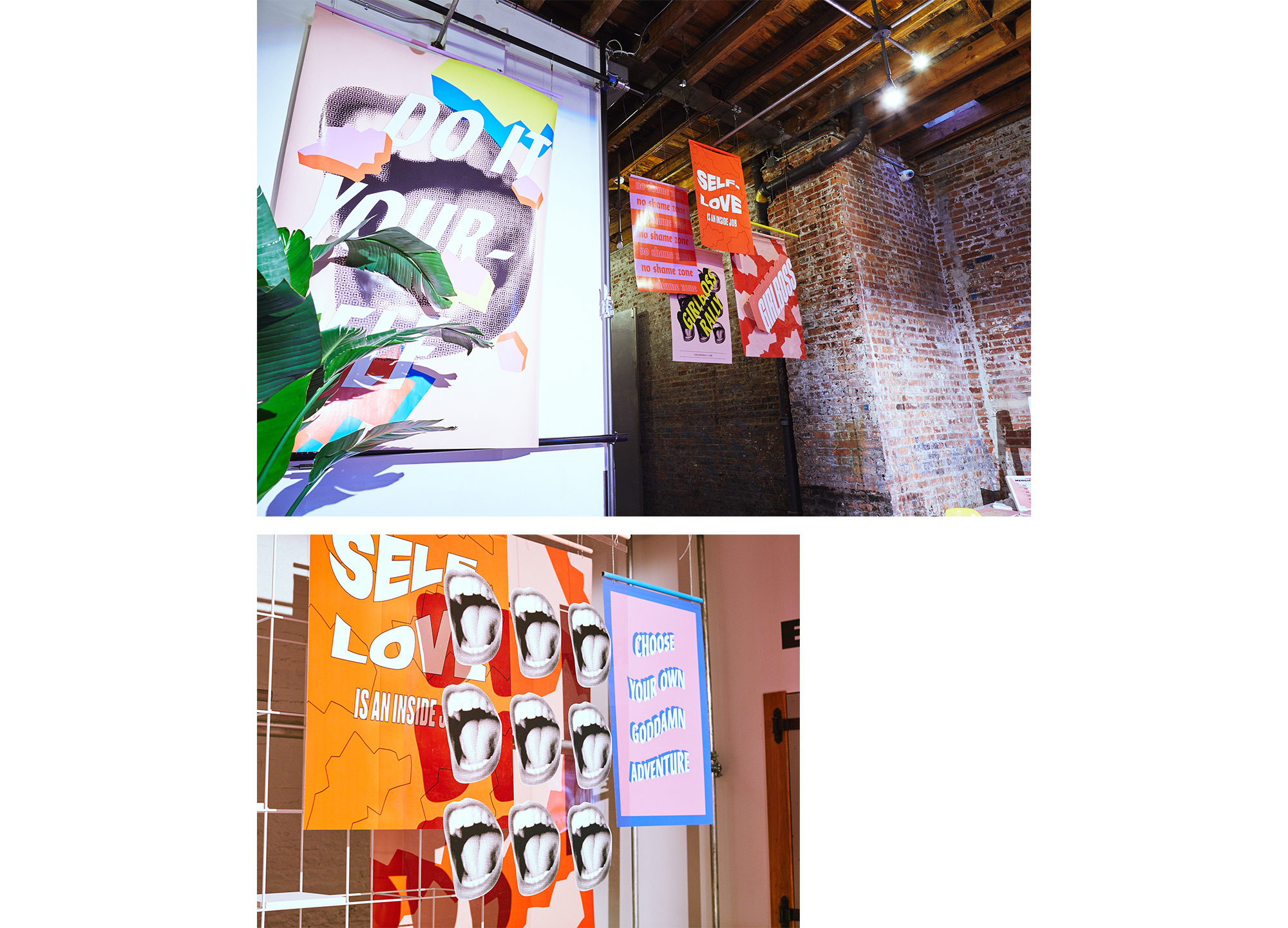
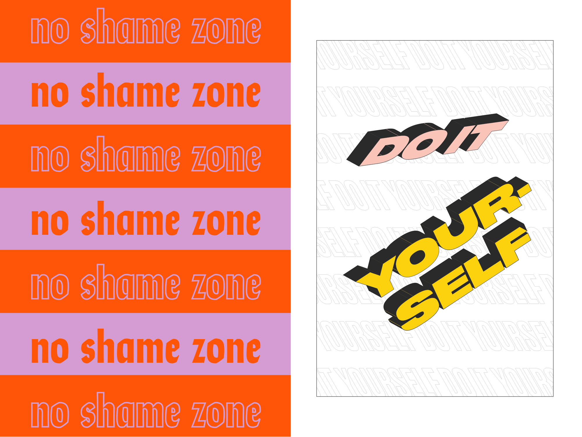
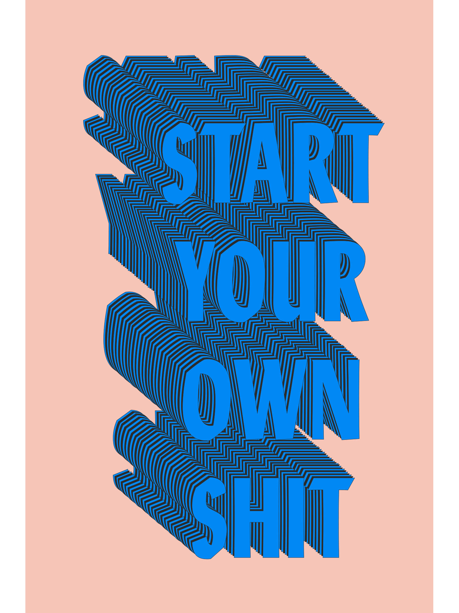
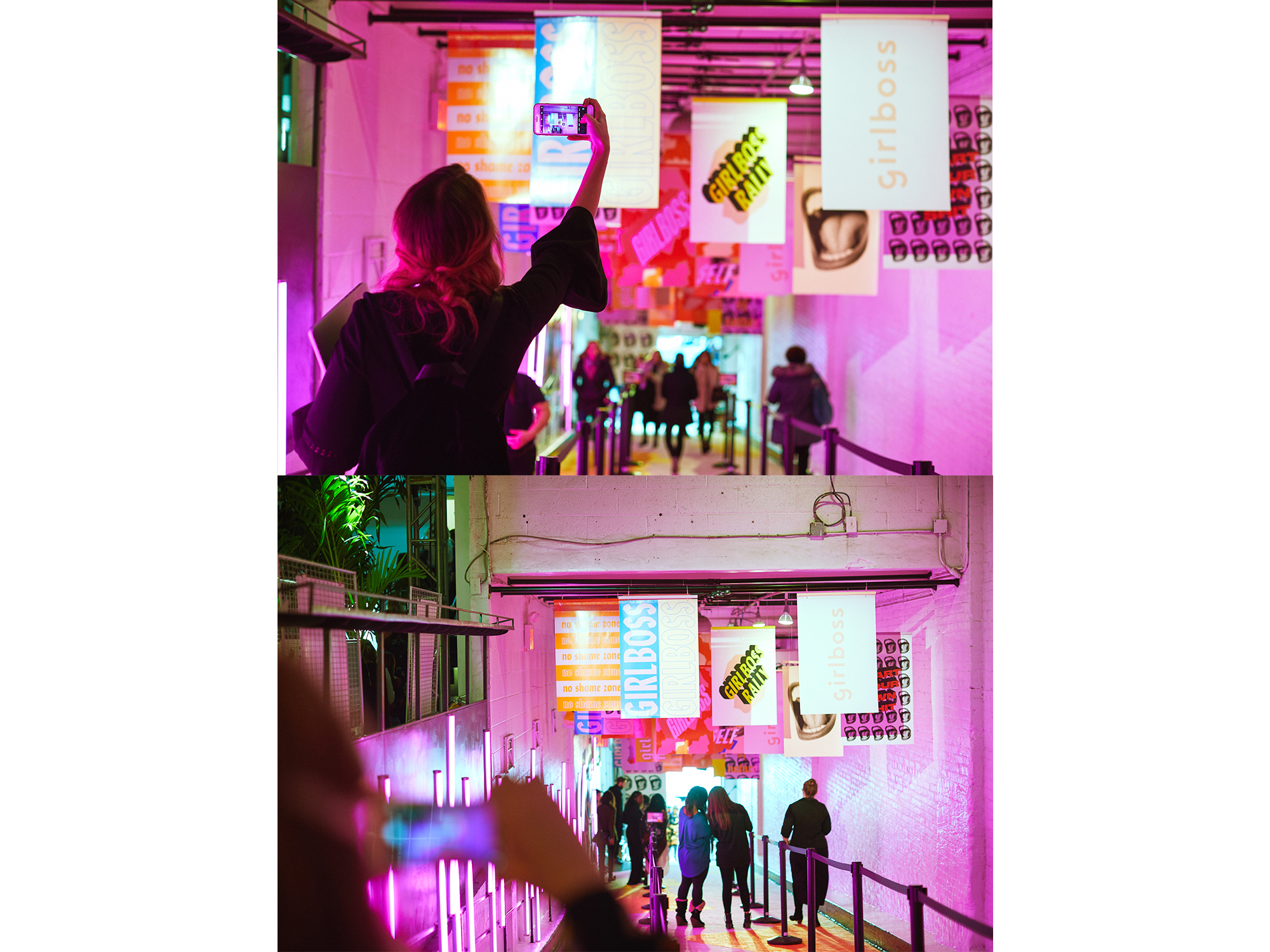
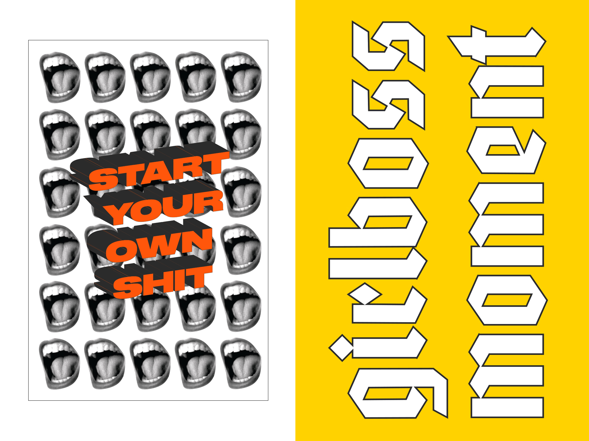
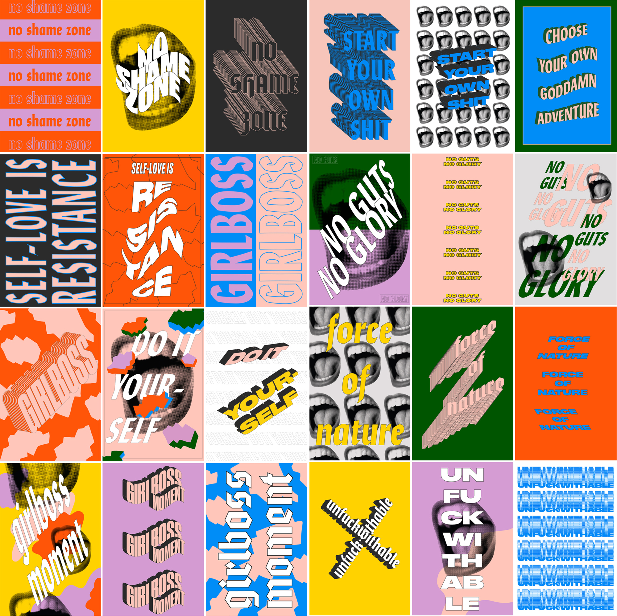
Thanks to the Girlboss team for sharing this victory with us, and enabling us to collaborate on #GirlbossRally New York.
Art Director: Chloe Parks @ Girlboss
Production: The Gathery
Graphic Design: Dani Roche
